Making a top-ranked art school stand out.
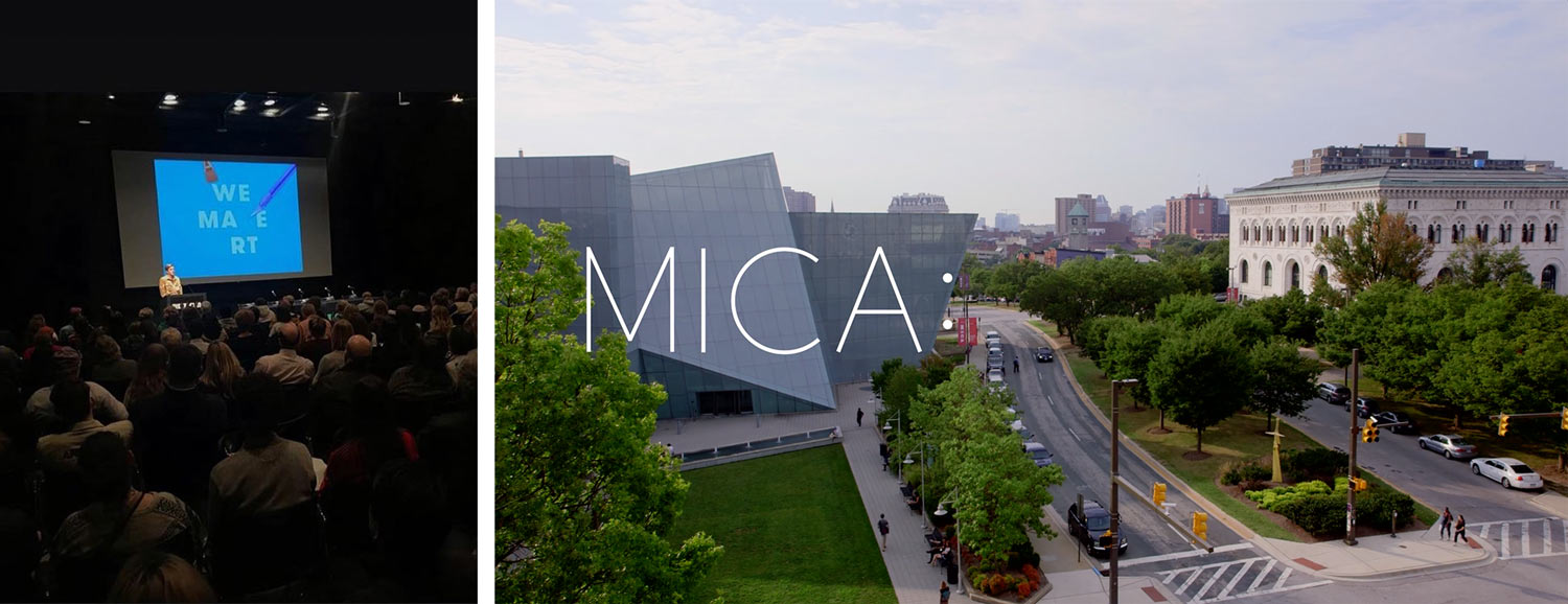
Shown to over 10,000 prospective students annually, MICA’s recruitment presentation is a crucial tool for attracting top applicants from around the world. Working closely with MICA’s Admissions Department, Post Typography has developed successive versions of this highly effective multimedia presentation. Students regularly cite our presentation design as a motivator for applying to or visiting the college.
A strategy to make the best even better
MICA’s recruitment presentation was already one of the best in the country, but we knew we could improve on our previous effort. We held a roundtable with MICA’s Admissions counselors and observed recruiters in action to identify the presentation’s strengths and weaknesses.
Animation, video, and humor keep the attention of high school students.
Designing an engaging narrative
We developed language and imagery to support and expand the concept “Make at MICA” throughout the presentation. Our design enhances the presenters’ script and showcases MICA’s exceptional community of makers.
The presentation’s pacing, content, and structure work together to deliver a consistent and engaging message.
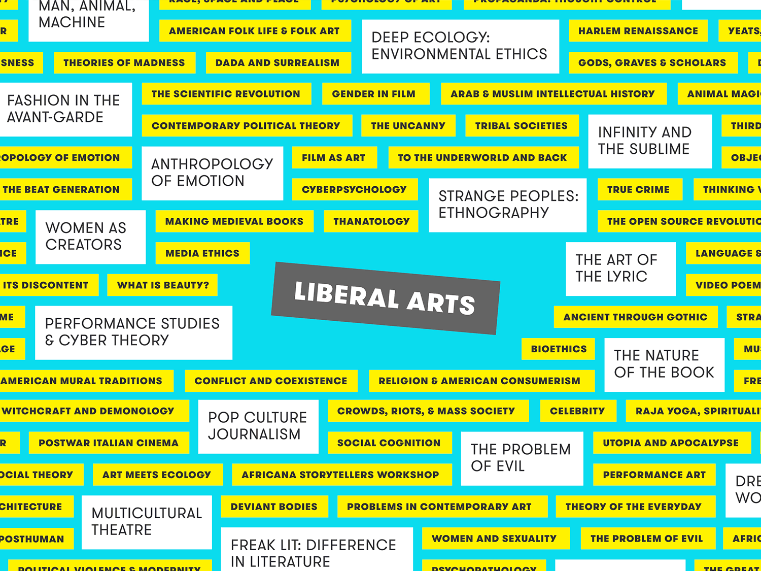
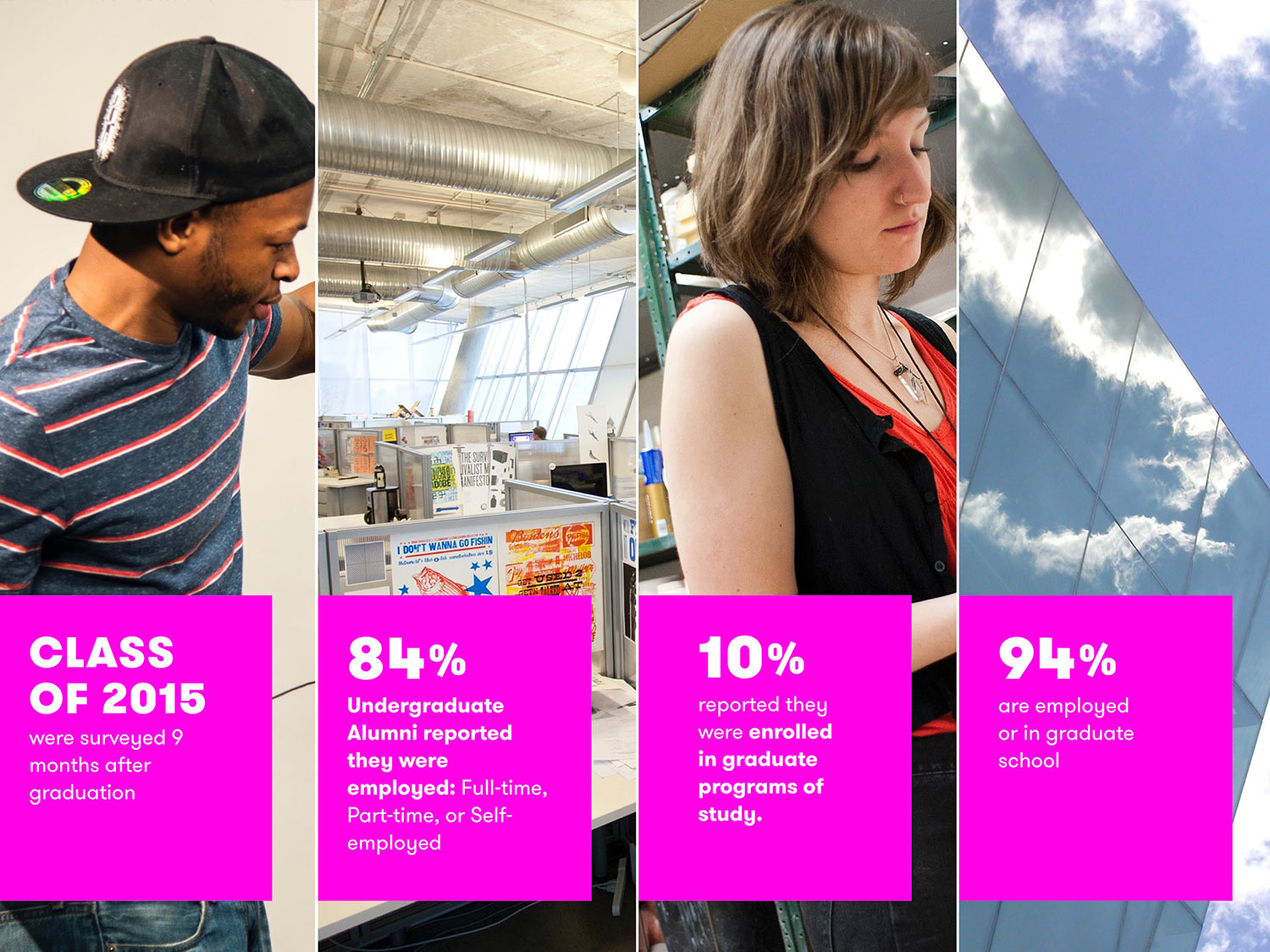
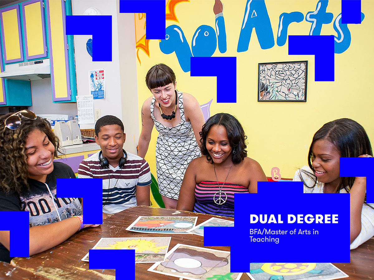
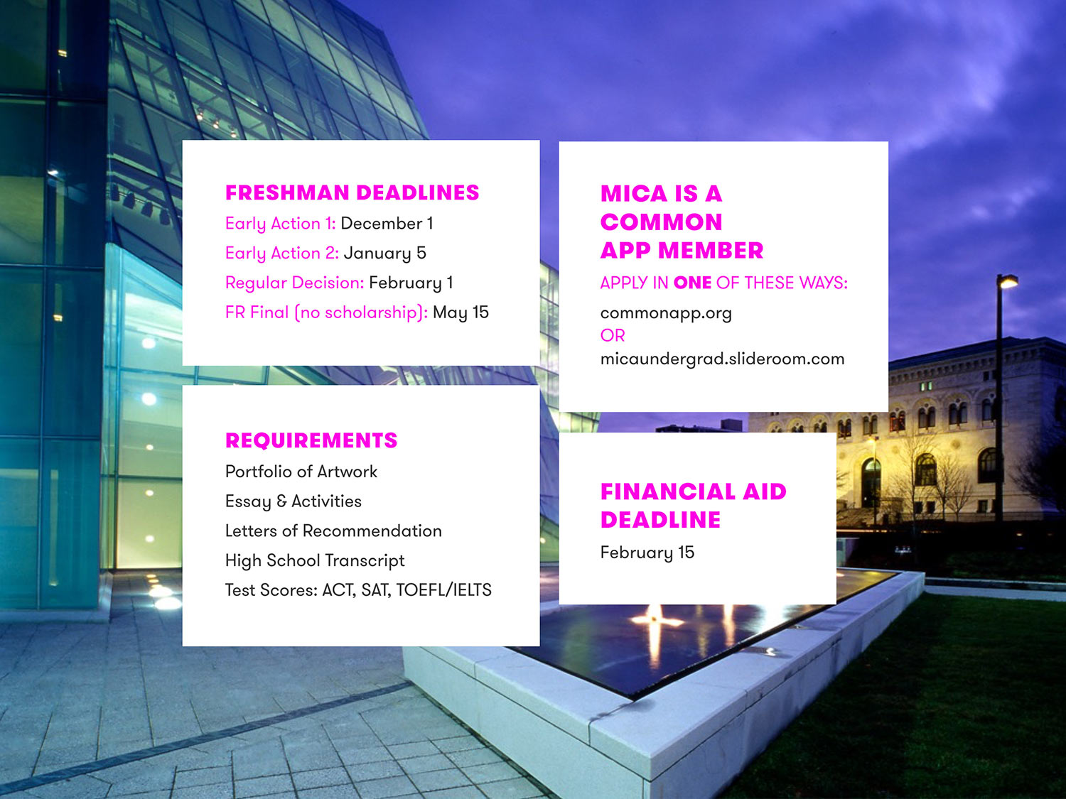
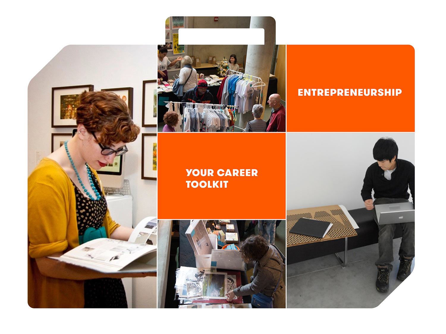

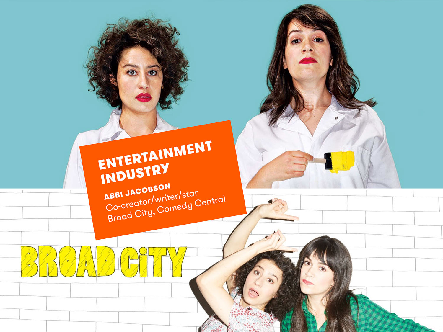
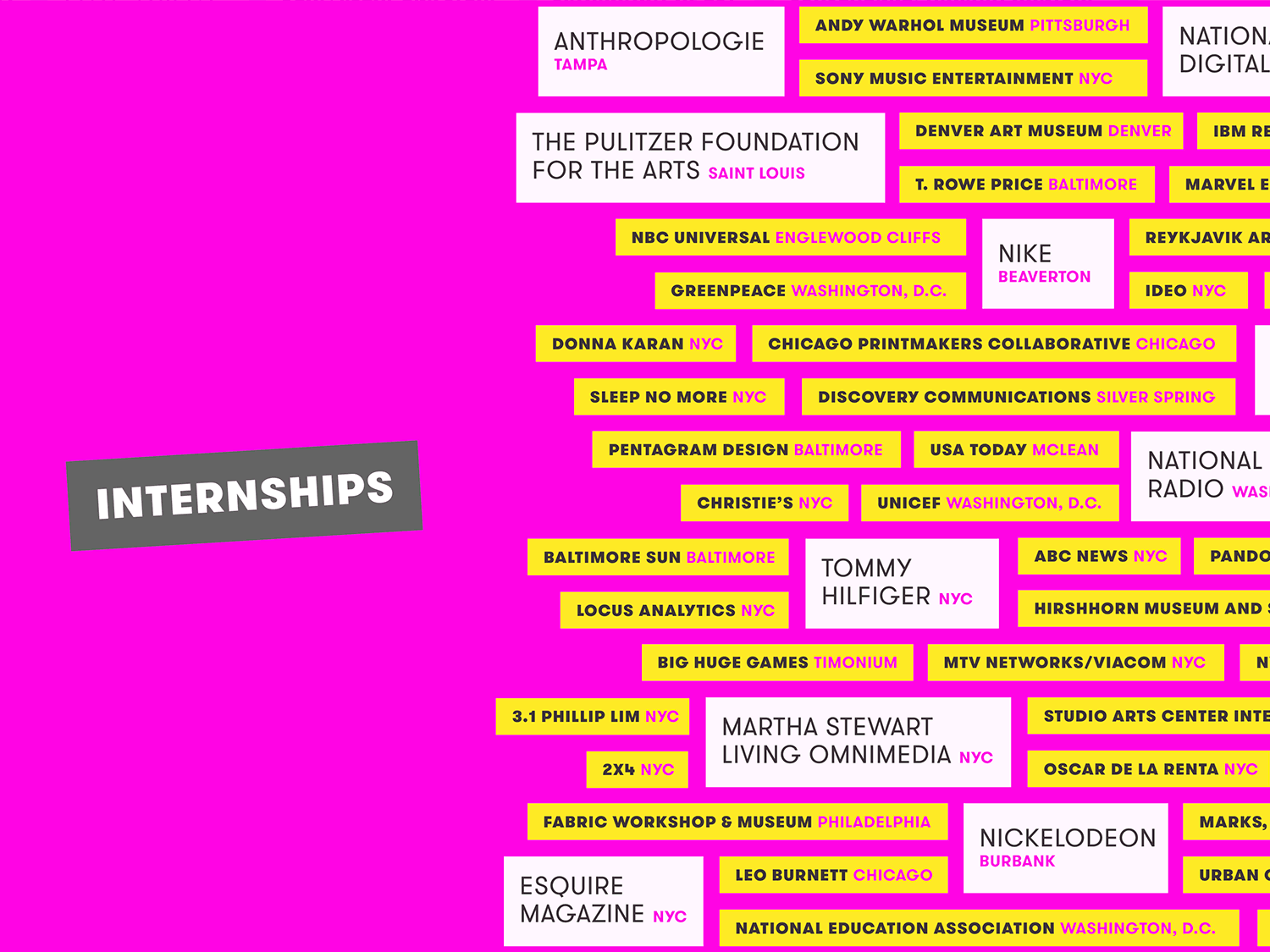
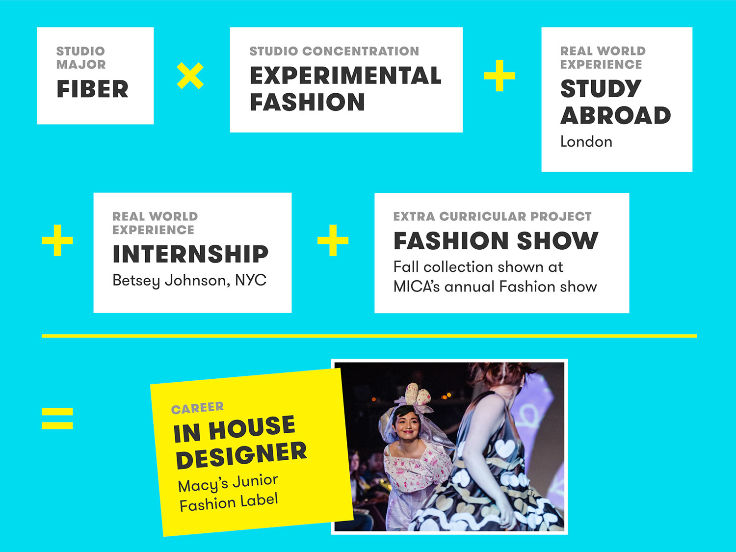
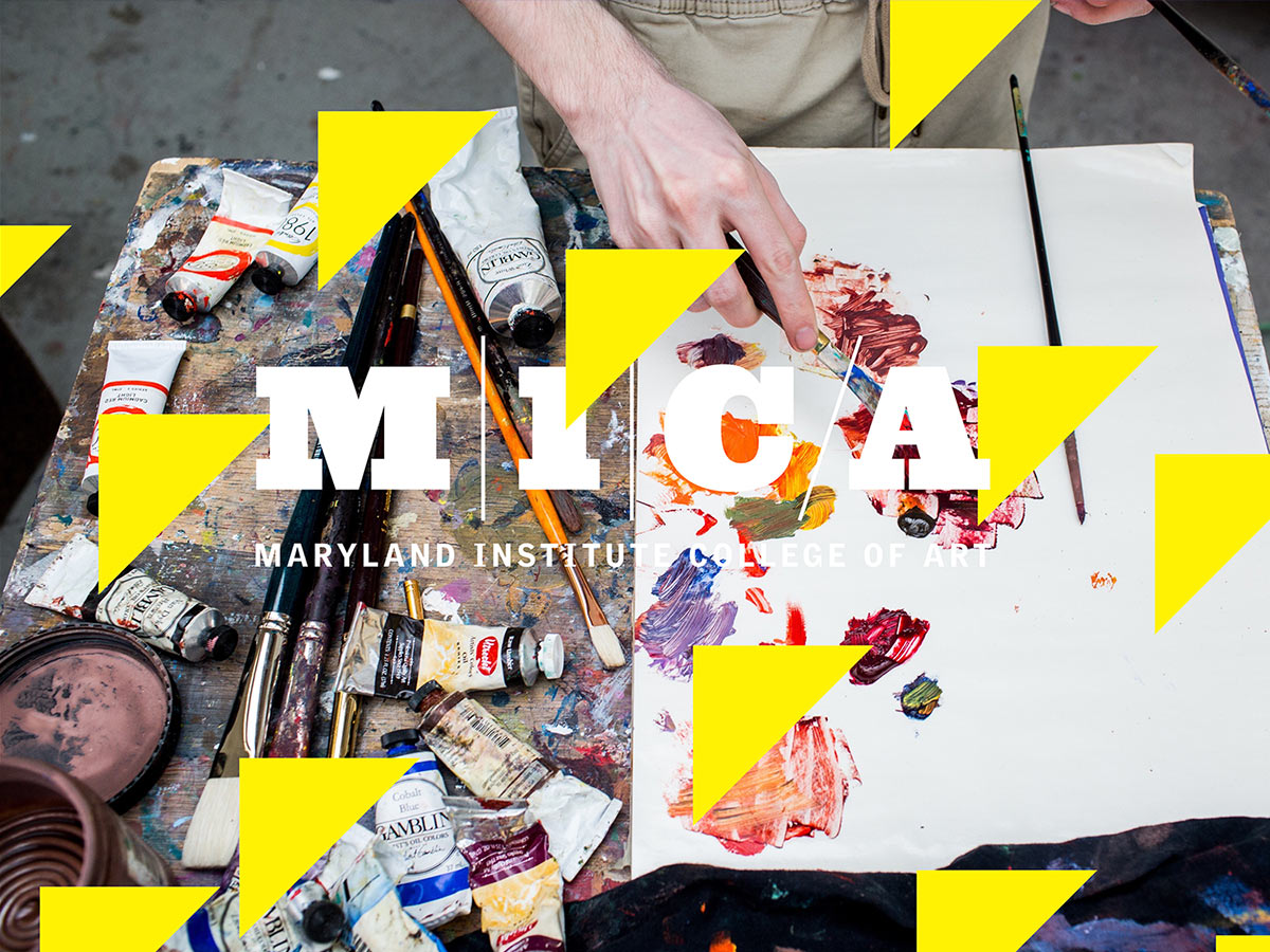
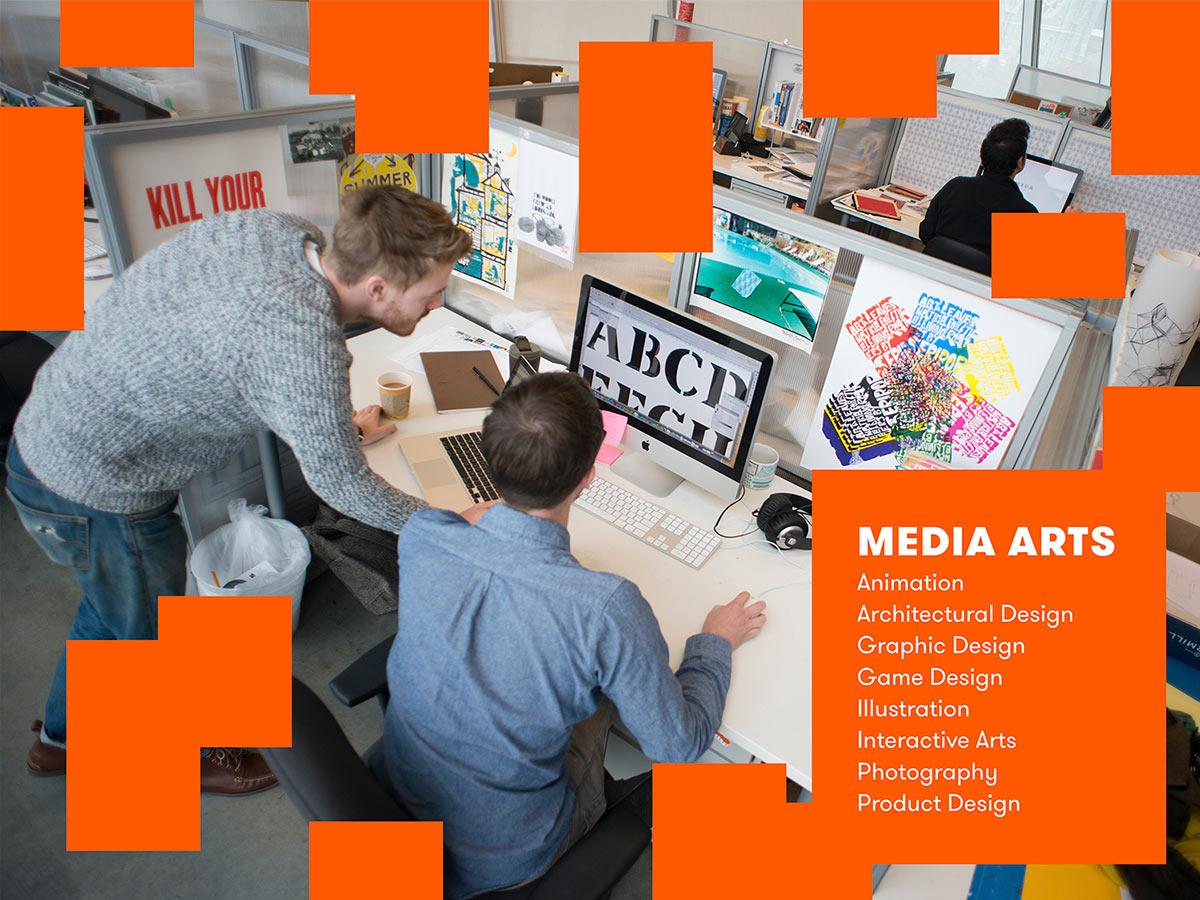
Each frame is beautifully designed
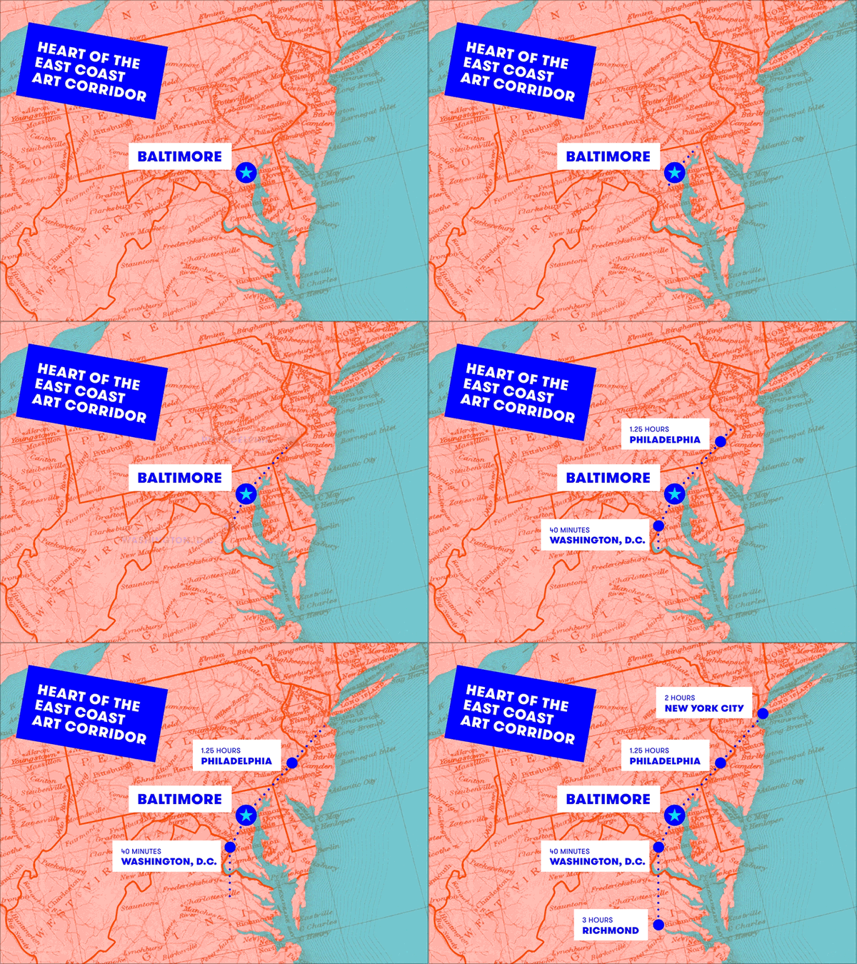
The visually-powered design pairs bright colors and contemporary typography with eye-catching photos of MICA’s campus, students, artwork. We curated the photography and student work to tell the MICA story from the campus to classroom to student activities.
We filled every section of the presentation with “Instagram-worthy” photos.
Playful, attention-grabbing animations
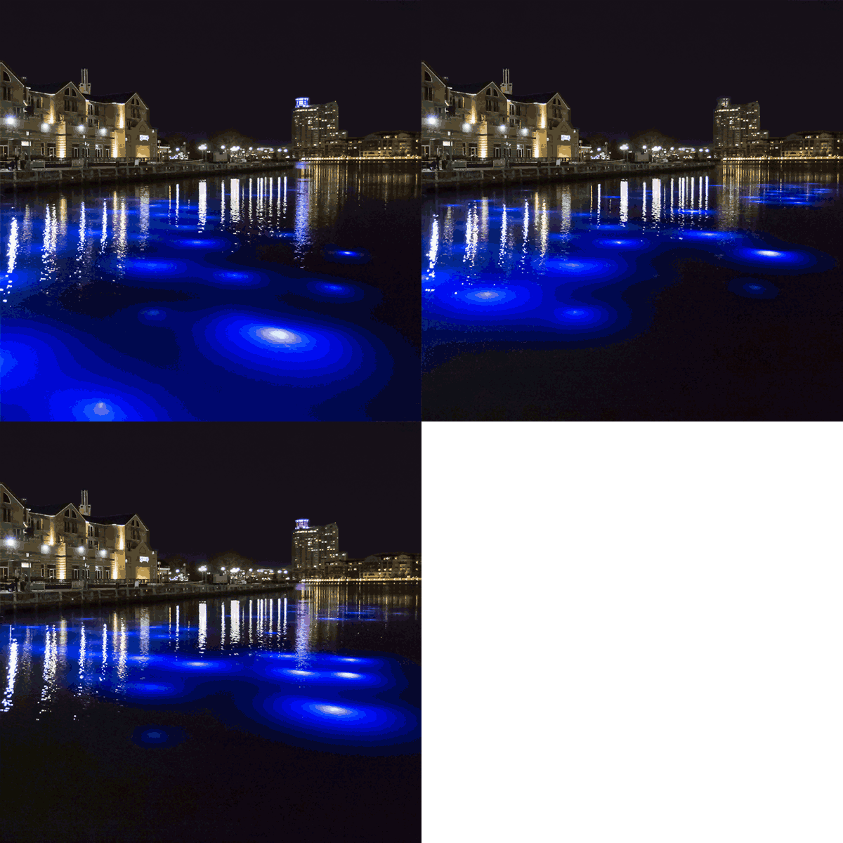
Animated title cards and transitions give the presentation structure and command the attention of easily-distracted high school students.
We conceived and produced a short video that puts viewers into the vibrant action of Baltimore’s incredible, diverse arts community.
A myth-busting video that tells a compelling story
Shown early on in the presentation, this video reveals a side of Baltimore not often seen in the national media’s one-dimensional narrative of our city. We wrote the script, scouted locations, and provided creative direction for style, music, and editing. The result is fresh, fast-paced and uplifting.
“Students are coming to see MICA because they’ve seen us give the presentation at their schools and said it was the best they’d seen.”
—MICA Admissions Counselors
See more of our higher education portfolio
MICA Career Development Graphic Identity

