Making cyber security smart, not scary.
Terbium Labs is a tech startup with a unique product, a dark web search engine and monitoring service called Matchlight. While much of the industry uses fear as a marketing tool, Terbium Labs wanted a brand that felt scientific, rational, and optimistic. Through forward-looking design and messaging Post Typography has helped position Terbium as a thought leader in data security.
A smart, flexible kit of parts
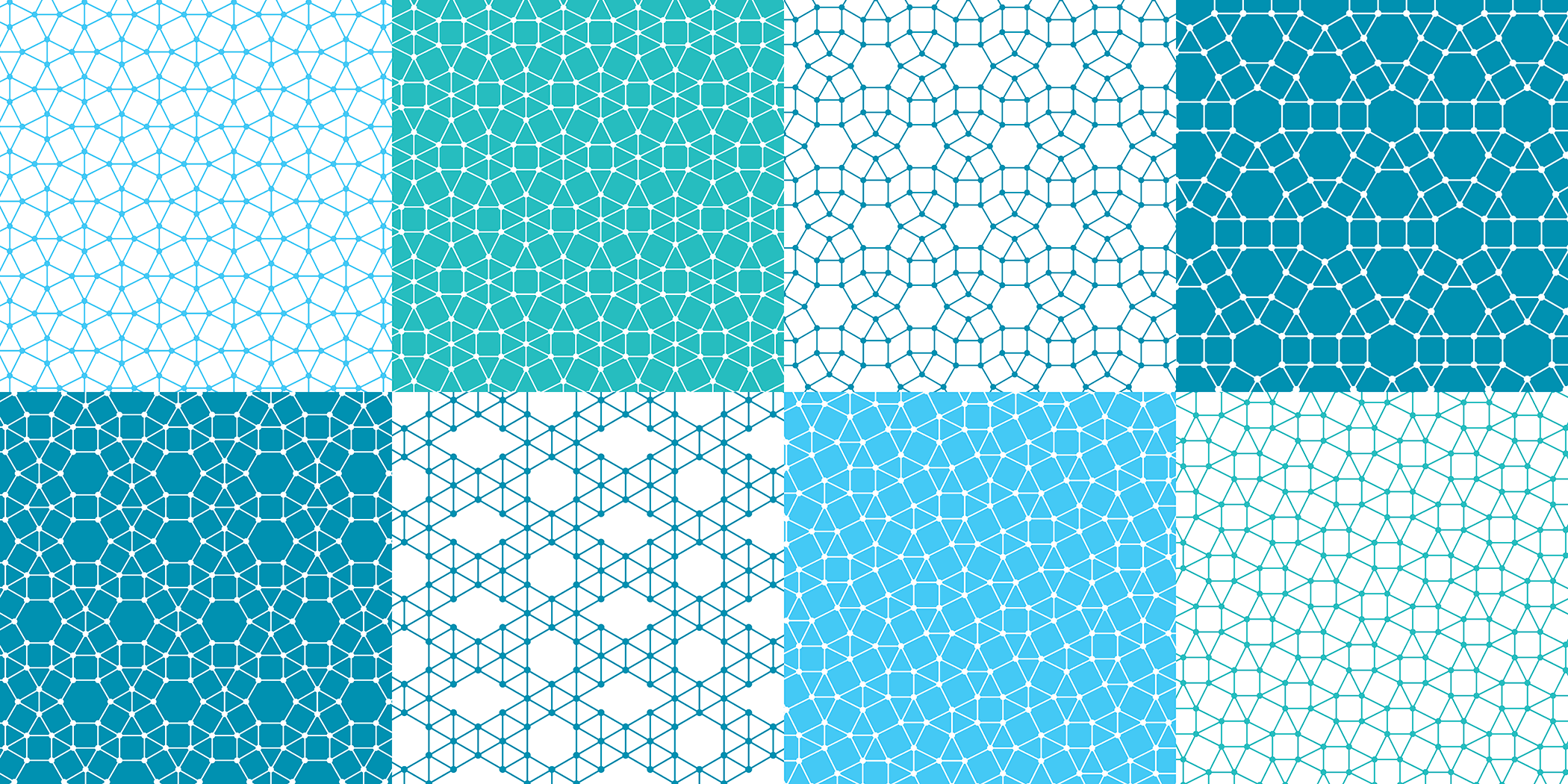
Post Typography conceived Terbium’s visual identity as a kit of parts that include logos, social media marks, and a versatile set of custom Archimedean patterns. The patterns can embody the dark web’s complexity as well as Terbium’s systematic approach.
A shapeshifting logo for an evolving product
The Matchlight logo grew naturally out of the Terbium Labs identity. Befitting this unconventional, evolving application the Matchlight logo’s configuration changes slightly with each use. The design suggests Matchlight’s “fingerprinting” technology and the continually shifting dark web.
Useful illustrative icons
We developed a contemporary illustration style to match Terbium’s graphic identity, creating a family of custom icons to support Terbium’s website and printed materials.
We created a bright, contemporary graphic identity for Terbium Labs and Matchlight that leapfrogs cyber security industry clichés.
An animation that distills complex ideas
On the Terbium Labs website, we created a succinct HTML animation to visually introduce what Matchlight does.
A website that engages, educates, and persuades
We designed an easy-to-navigate website that explains how Matchlight works, and how clients can deploy this innovative technology. Approachable language and illustration show how Terbium’s services can be tailored to each client’s needs.
Color, animation, illustration, and sophisticated typography give the website its distinct personality.
A beautiful and intuitive UI
Many cyber security tools require steep learning curves. We designed Matchlight’s interface to be self-explanatory. A quick onboarding process, integrated setup tutorial, and clear functionality make it easy to start using the application’s data monitoring and dark web search engine.
We worked with Terbium to distill Matchlight’s core functionality and envision a framework for future interface features.
Cohesive branding for all communications
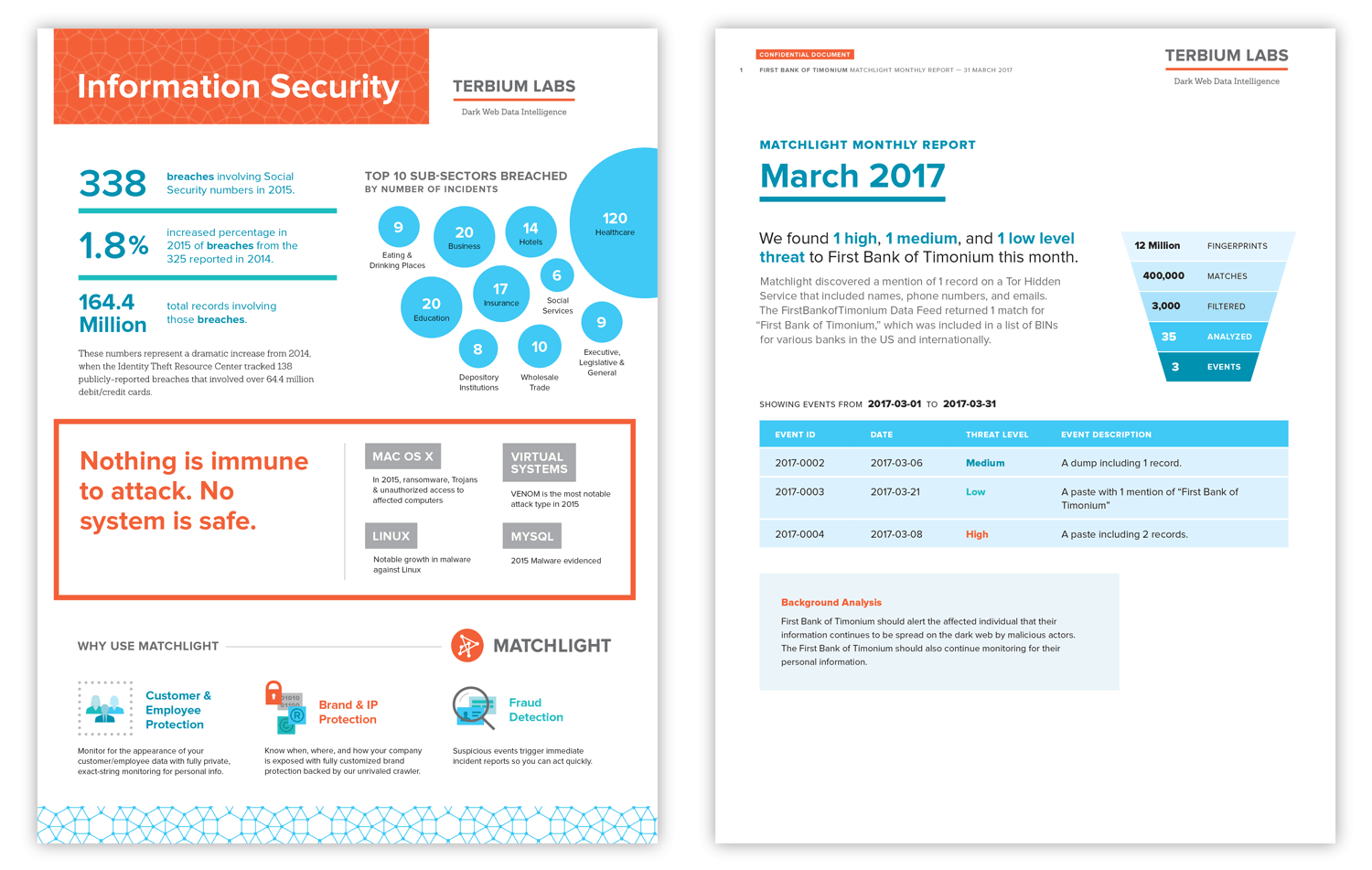
We gave Terbium Labs client reports and marketing sheets a consistent look. Engaging design and clear visual hierarchy make these documents easy to digest.
Trade show spaces that make you look
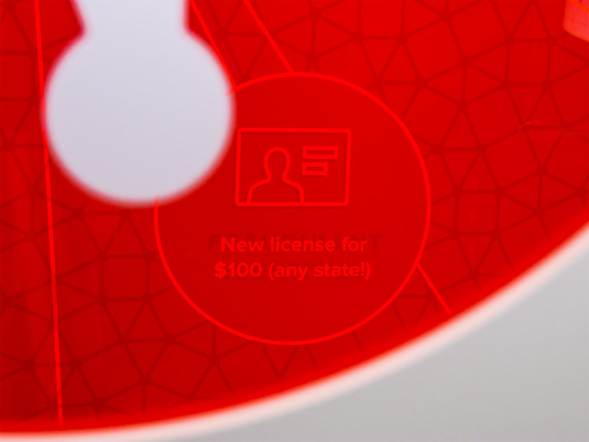
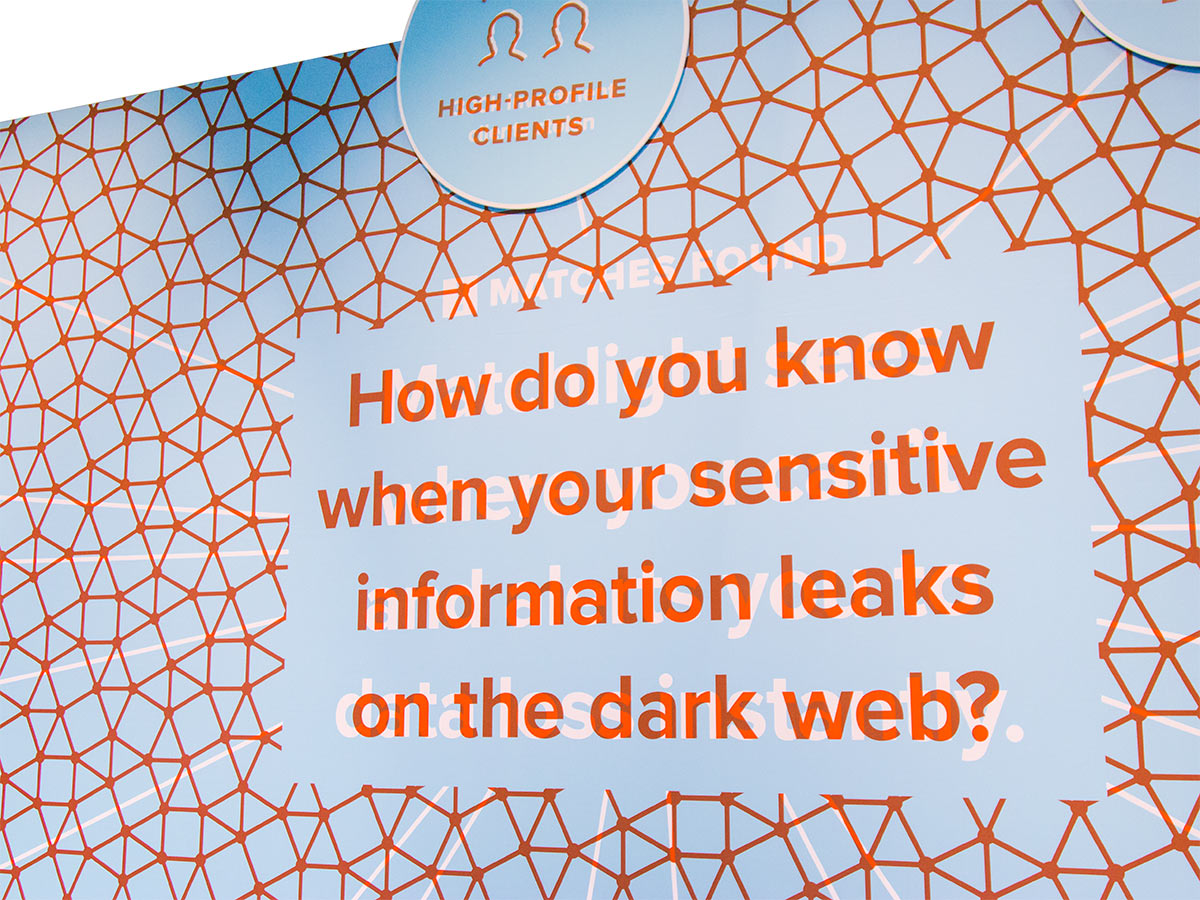
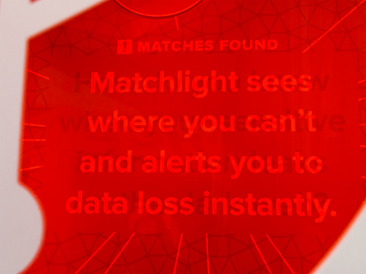
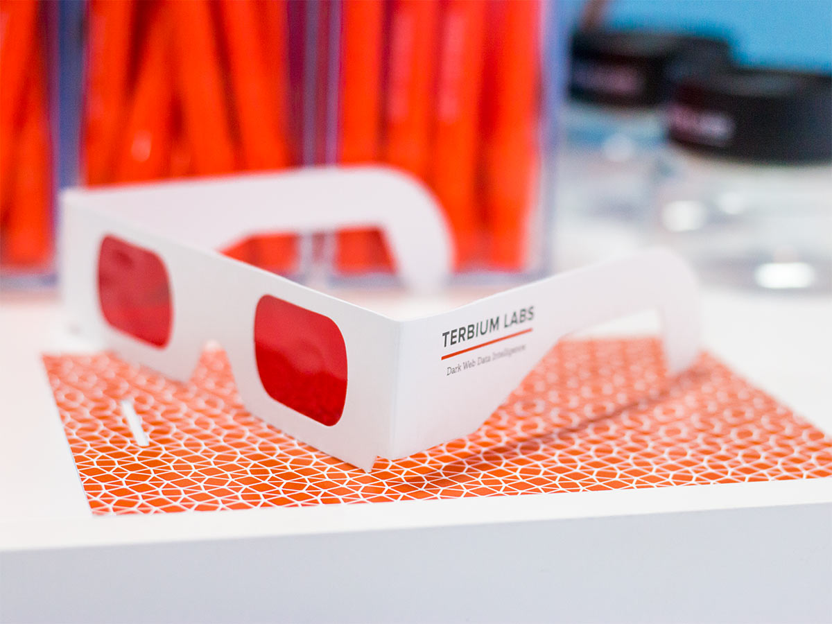
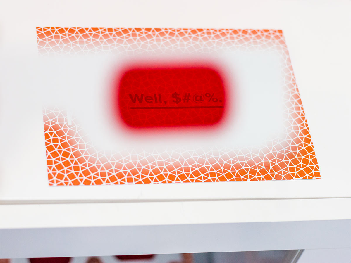
Post Typography’s booths for Terbium are designed to create memorable trade show experiences. In this interactive space, visitors use the Matchlight logo as a decoder lens to spot stolen data on the dark web.
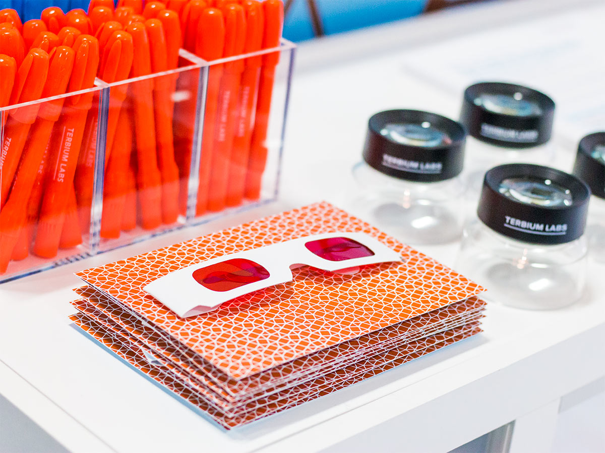
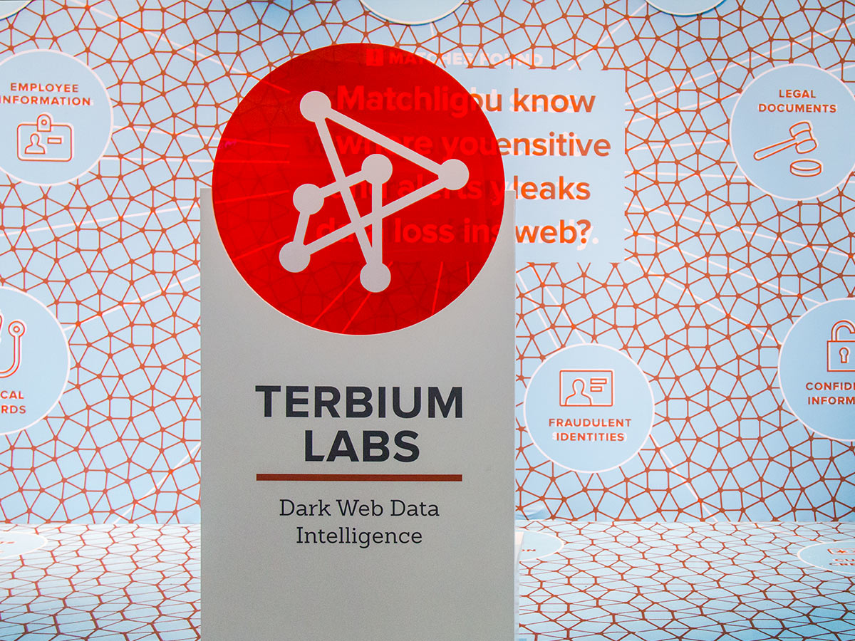
“Our trade show booths consistently attract crowds drawn in by their unique design.”
— Stacey Sweeney, Chief Marketing Officer
“Relax, We’ve got this”
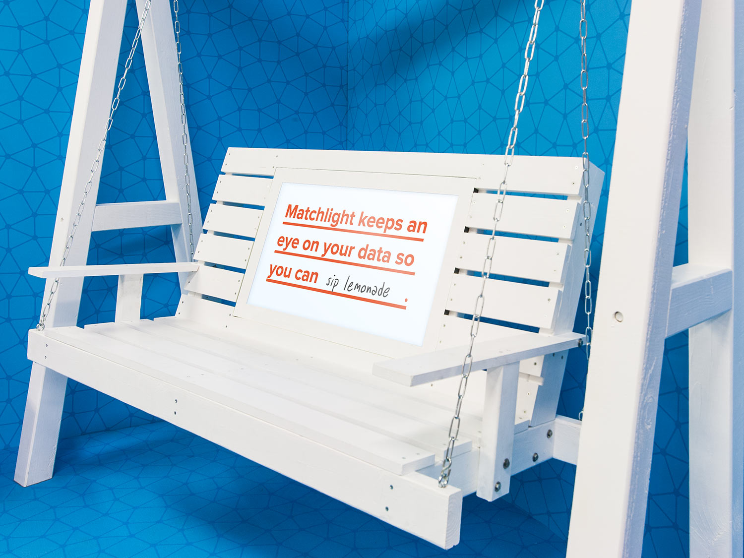
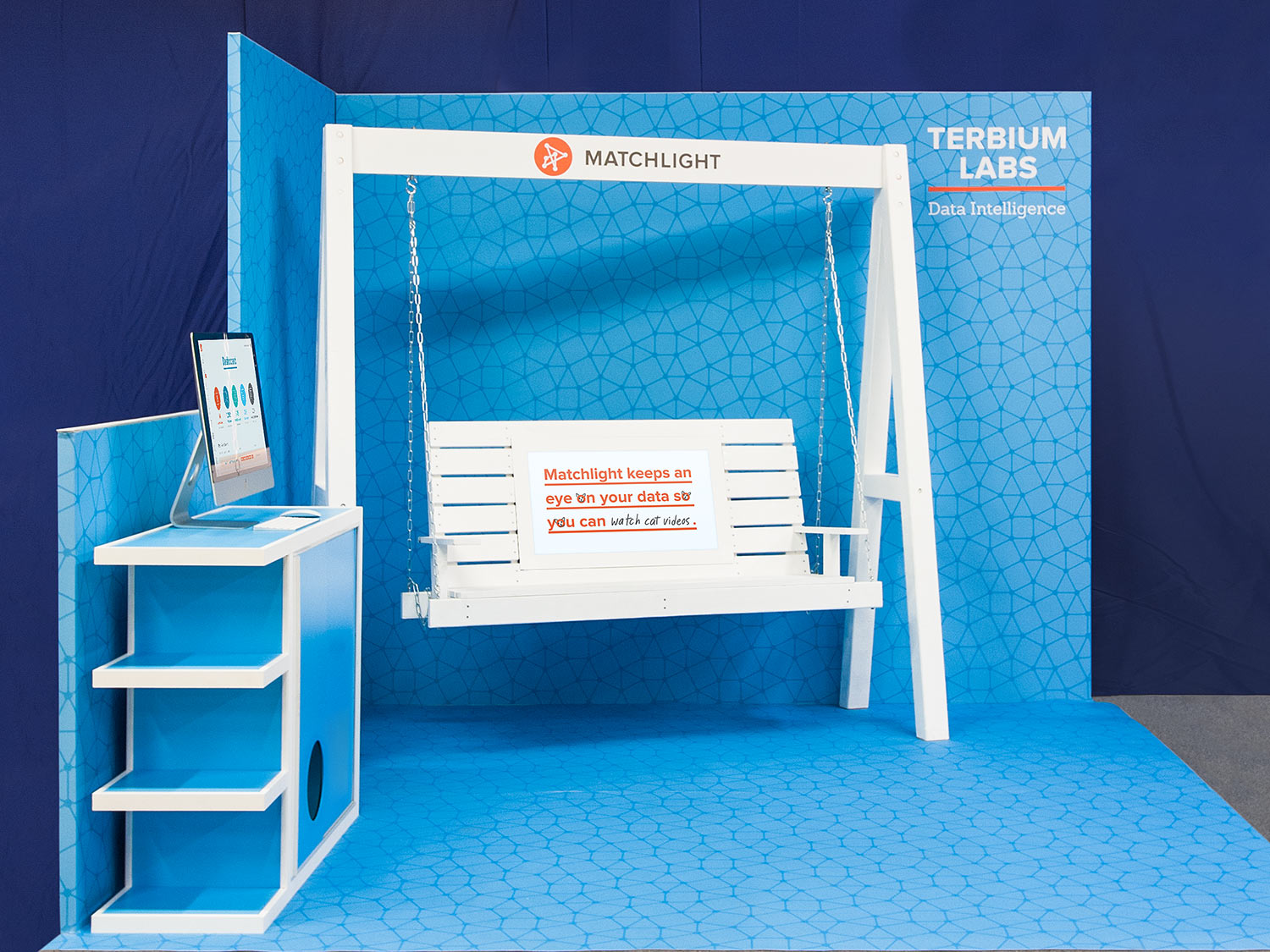
For Terbium Labs’ first trade show, we wanted to do something shockingly different from other companies’ booths. A monitor embedded in the seat back of a porch swing displays messaging that encourages users to relax. Unexpected giveaways include sunscreen, bottle openers, and air plants in cute display carriers.
