Positioning trees as a crucial tool for 21st-century city planning.
We worked with the U.S. Forest Service and American Forests to create Vibrant Cities Lab, the definitive resource for contemporary urban forestry practice and advocacy. This indispensable tool for municipal leaders, advocates, and urban forestry professionals uses fresh design and clear-eyed typography to present over 500 pages of content in an easily digestible manner.
Reframing urban forestry with contemporary design
Most people think that trees are just pretty. But leading cities increasingly use urban forestry strategies to improve health, safety, sustainability, and economic growth. With its contemporary design approach, Vibrant Cities Lab takes a subject often perceived as “crunchy” or “hippie” and shows its cutting edge applications.
The website content focuses on science and results, while the design avoids “green” clichés.
Diverse audiences can use site in different ways
Vibrant Cities Lab needed a robust navigation and clear UX. Heavily cross-linked pages accommodate readers who prefer to browse organically, while a powerful interface allows users to reach any page on the site within two clicks. For urban forestry novices, thematic “Impact” sections highlight the benefits of trees. And seasoned practitioners can jump to the Urban Forestry Toolkit or search the site’s extensive Resource Library.
For an intuitive user experience, it was paramount to include multiple ways to navigate and experience the site.
Color as signifier
Jewel-like shades of color give Vibrant Cities Lab a glowing, optimistic atmosphere. Cool greens demarcate the advocacy-oriented sections of the site while orange is reserved for implementation pages found in the Urban Forestry Toolkit. Yellow is a universal color that is used to highlight research and resources throughout.
The site’s color palette is as vibrant as its name and is also used as a secondary navigational device.
Smart, sleek, and engaging
Although the site needed to feel both authoritative and progressive, we took pains to avoid “governmental” and “granola” aesthetics. Our design features modern type and big photos to make the site readable, immersive, and tech-savvy. Dynamic typography helps to differentiate the site’s complex levels of information, while infusing the site with a contemporary journalistic flavor.
A research-based site can be easy-to-use and visually compelling.
Compelling messaging, approachable language
Even when a website’s content is rigorous and scientific, we believe in stating things plainly and approachably. We worked closely with our client-partners to establish a clear, coherent and conversational writing style for Vibrant Cities Lab.
Even before the project began, we worked collaboratively with the client to define the scope, goals, approach, and vision for the website.
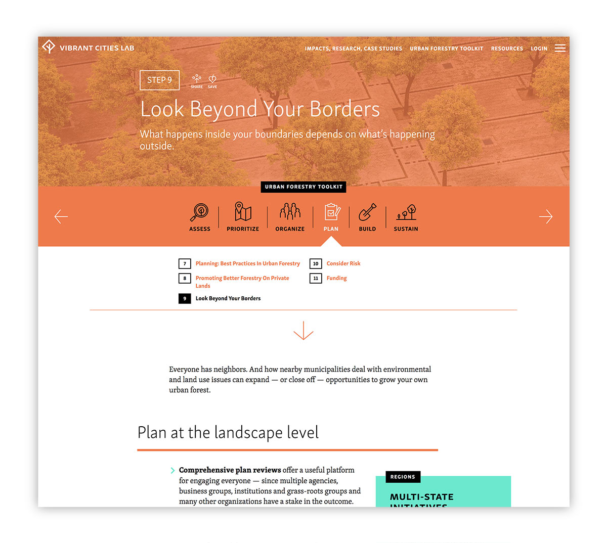
Examples of Research summaries and Urban Forestry Toolkit pages on Vibrant Cities Lab.
Easy-to-digest content
The website’s design and writing work hand-in-hand to divide each page of the site into quickly skimmable sections. Liberal use of call-out boxes, lists, and factoids allow tree advocates to easily summarize and share VCL’s compelling research in their own case-building presentations.
Reaching beyond the web
To introduce and promote Vibrant Cities Lab we helped U.S. Forest Service and American Forests launch a branded promotional campaign for targeted outreach at conferences and select trade publications.
We designed an inexpensive, portable trade show booth that punches above its weight class, using a combination of off-the-shelf and custom-fabricated elements.


