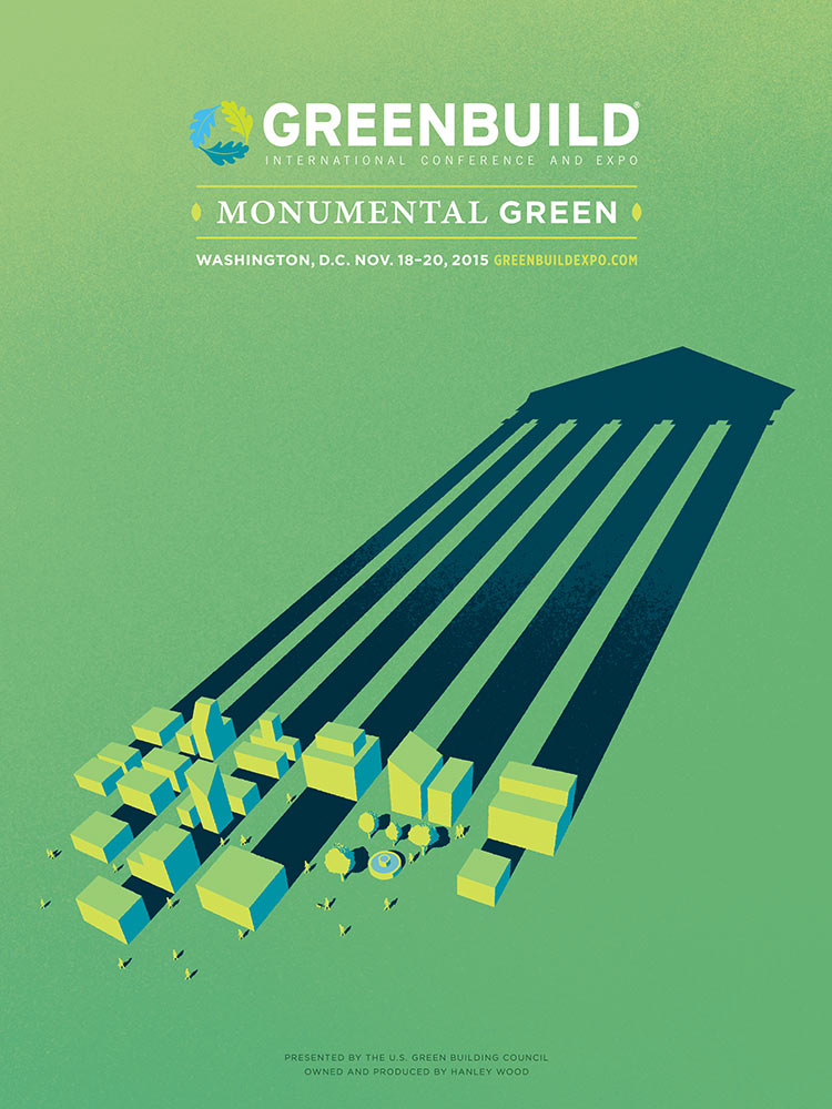
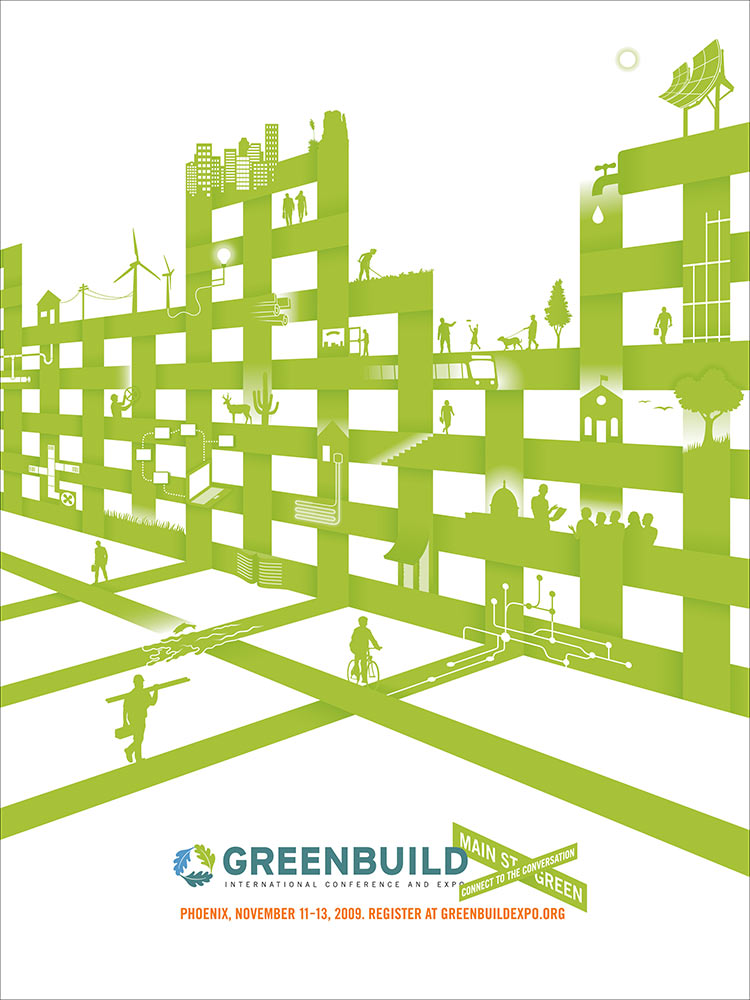
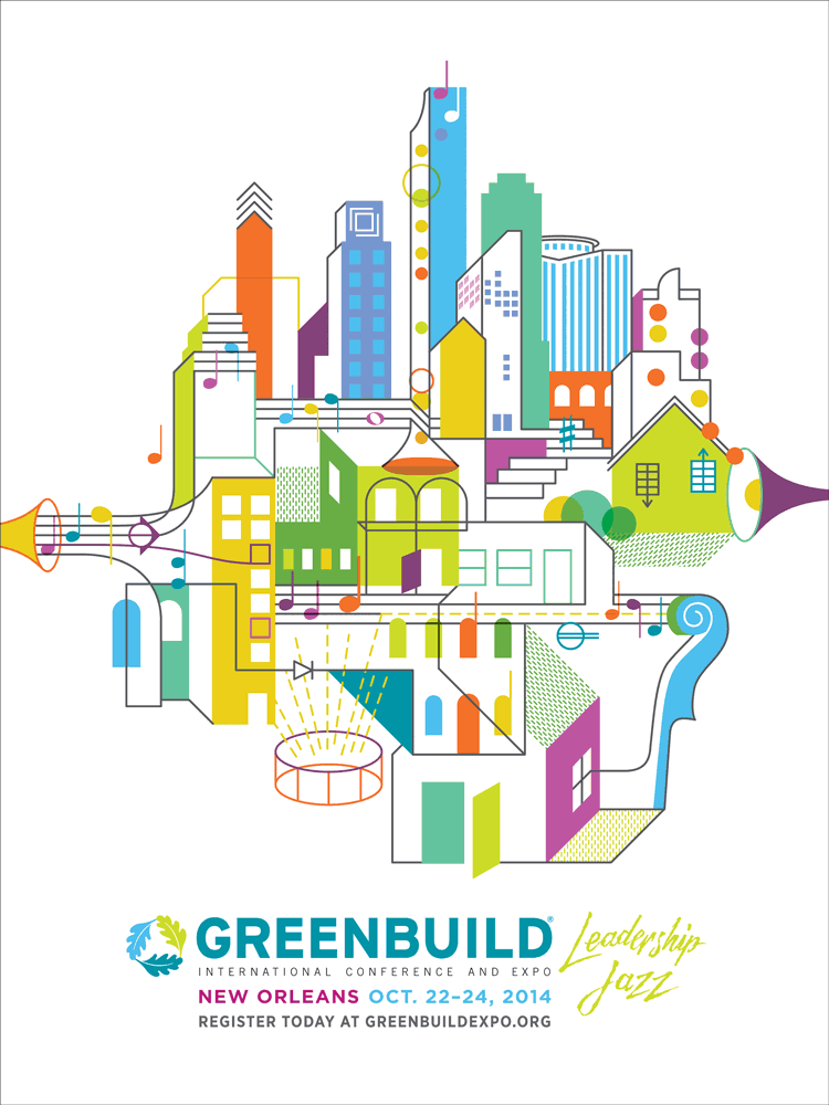
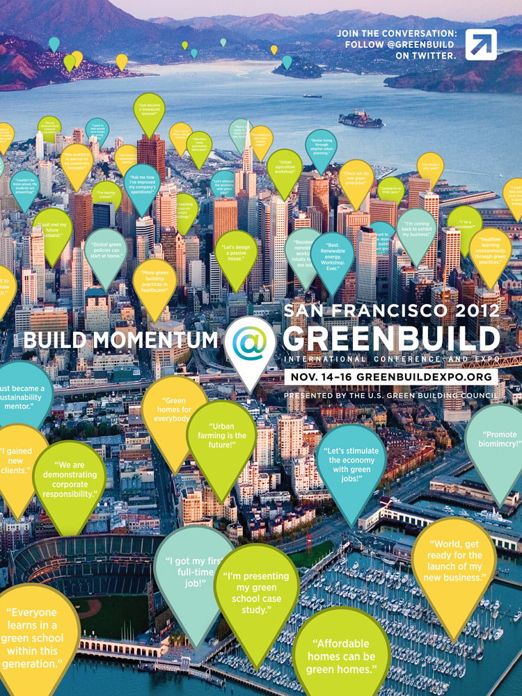
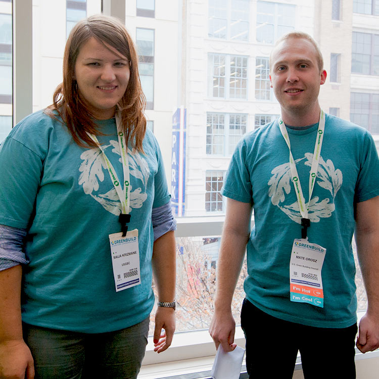
Designing an inspirational brand for the world’s largest sustainable building event.
Greenbuild is more than just a conference, it’s the meeting place for a movement and an annual gathering of sustainability thought leaders. For more than a decade our design work has powered Greenbuild’s marketing campaigns, environments, and merchandising, capturing the energy and diversity of the green building movement.
Our influential design campaigns have defined the look and voice of the sustainable building industry for the last decade.
Below are two of our favorite campaigns from 2010 and 2013.
Building a Diverse Movement
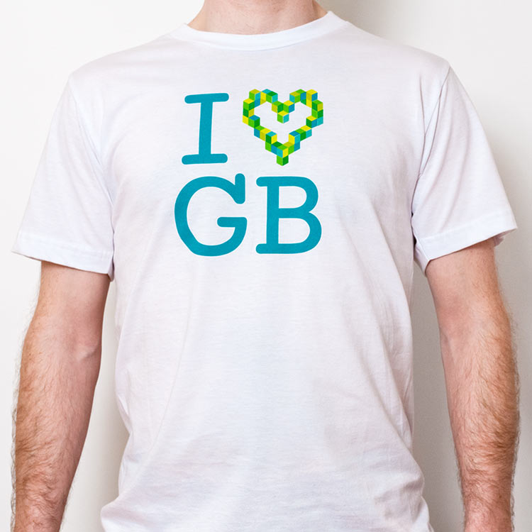
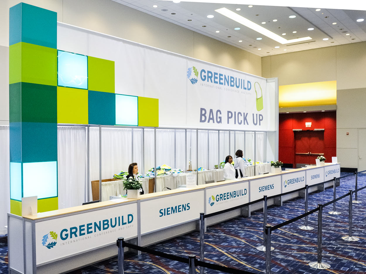
We constructed our brand design for Greenbuild 2010 from colorful cubes that suggest structures and building blocks. A series of eye-catching illustrations express the convergence of the green building movement at Greenbuild.
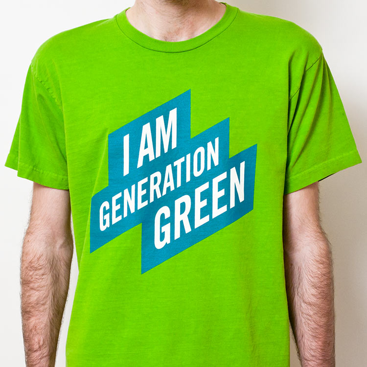
We engaged social media audiences to collect their ideas for Generation Green, which we featured in ads and on the Greenbuild website.
Event Structures and Wayfinding
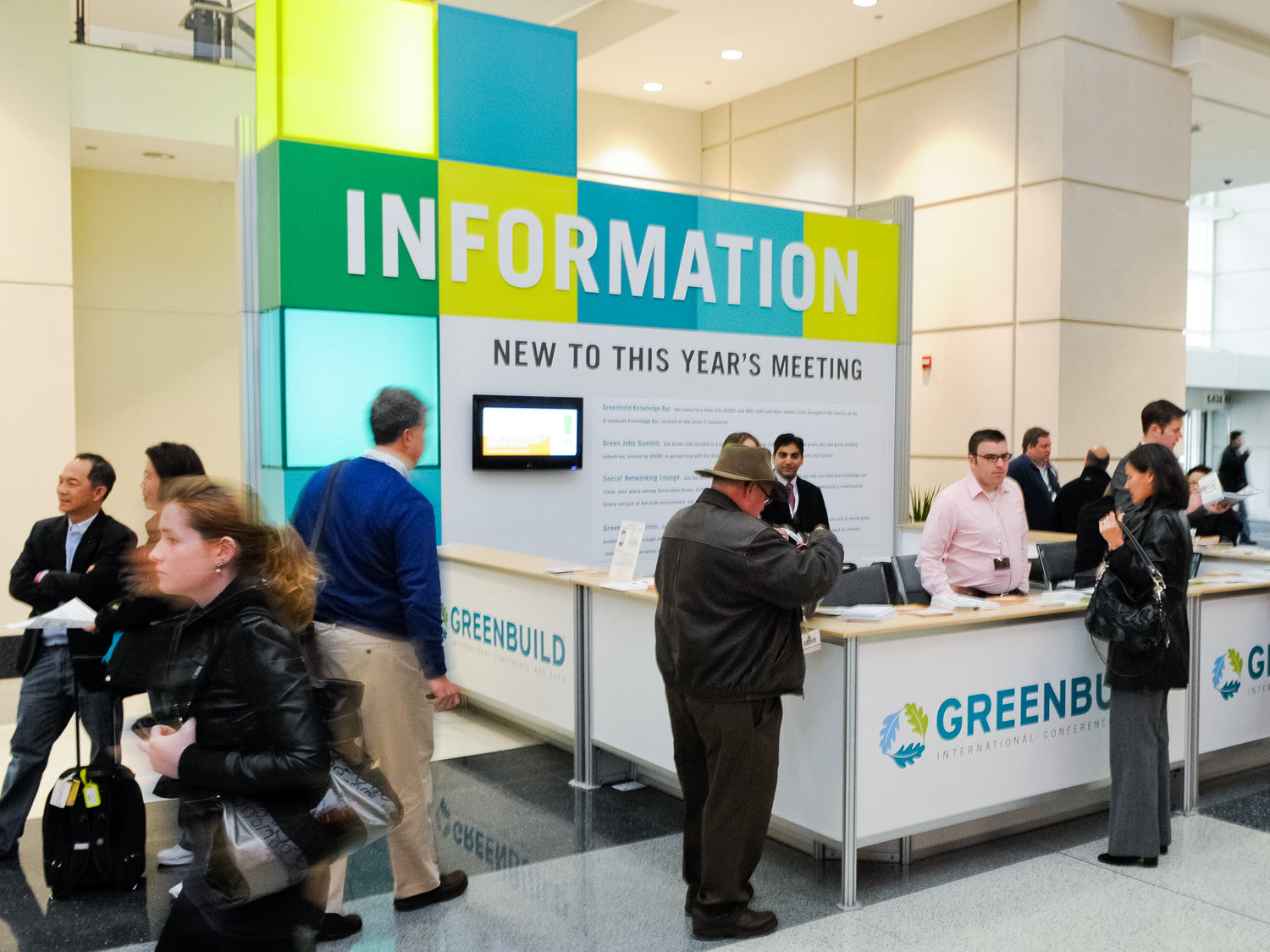
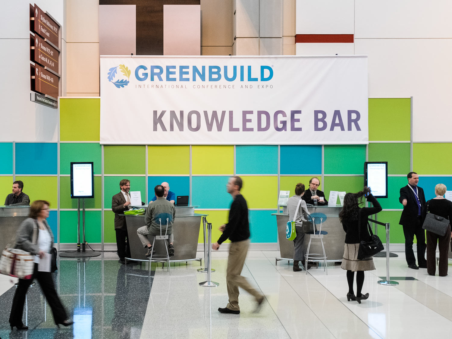
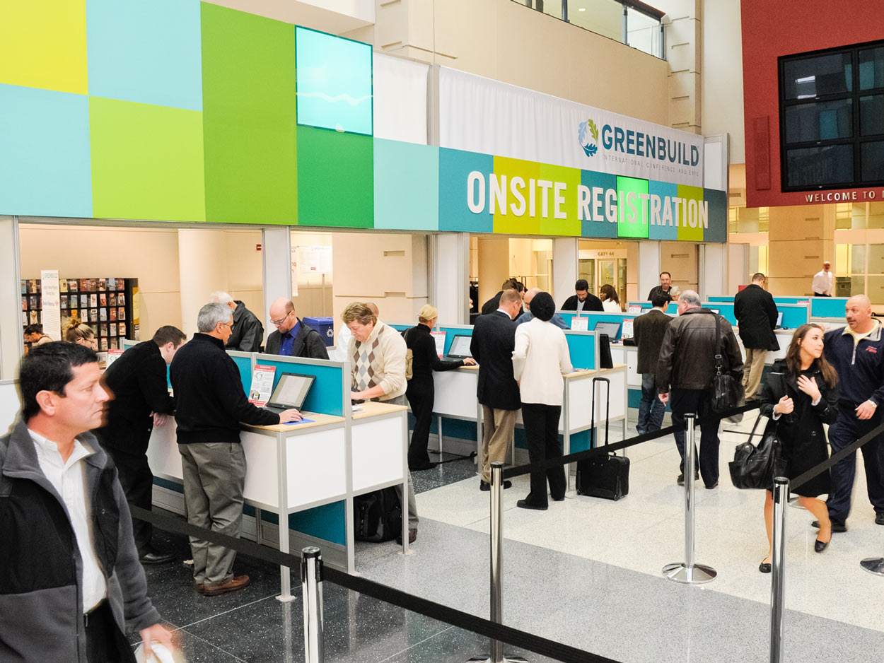
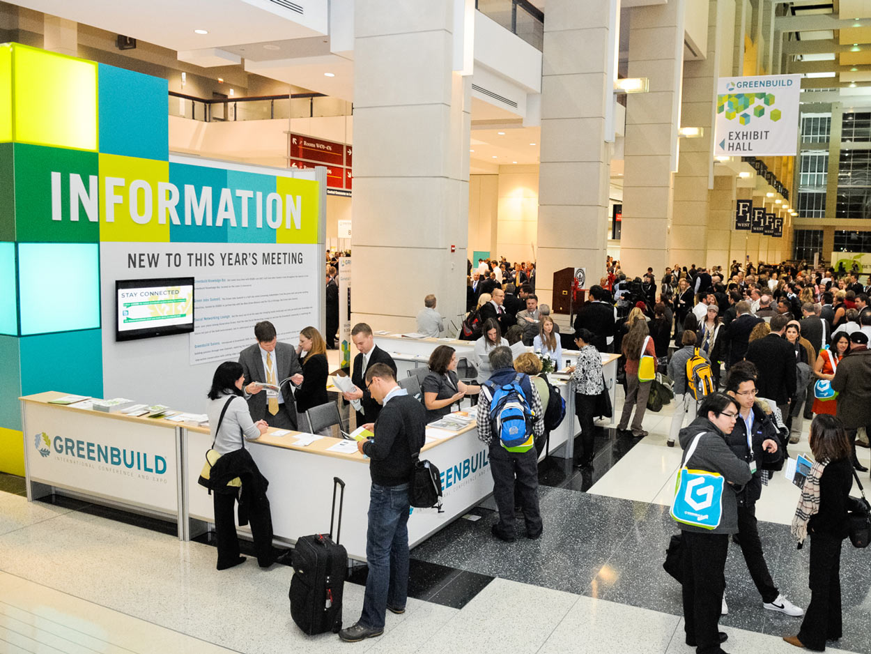
We worked with Greenbuild’s fabrication team to provide creative direction. The cubes became a modular three-dimensional element for trade show furniture, booths, and wayfinding signage. We even proposed fabricating our “G” illustration as an information kiosk.
28,000 attendees from 114 countries convened in Chicago for Greenbuild 2010.
Custom Bags and more
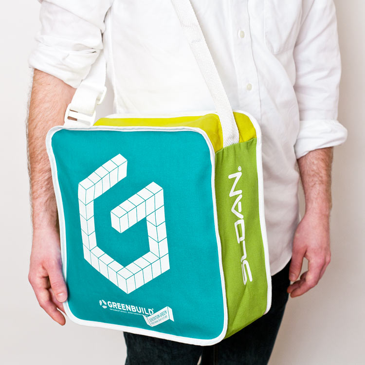
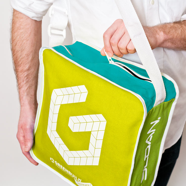
We designed this custom “cube" tote bag for the 2010 expo. Six different versions of the bags—created from different color combinations of the recycled cotton fabric—echo our design for the conference branding.
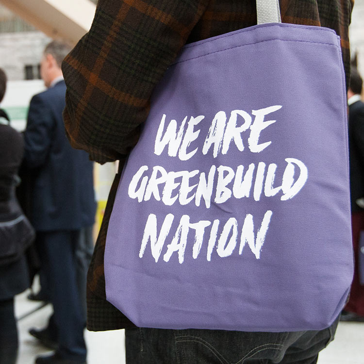
We’ve applied each year’s Greenbuild branding at every scale imaginable.
Writing a New History
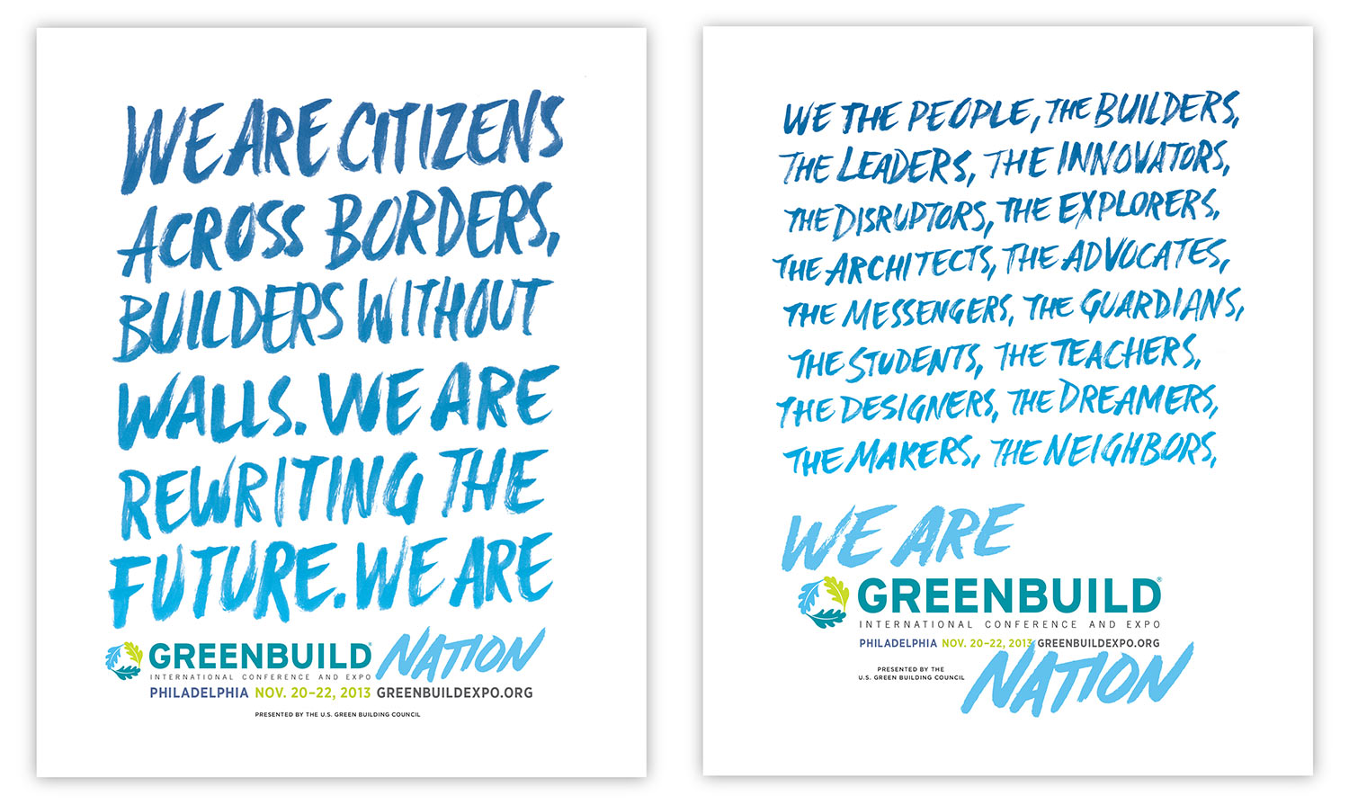
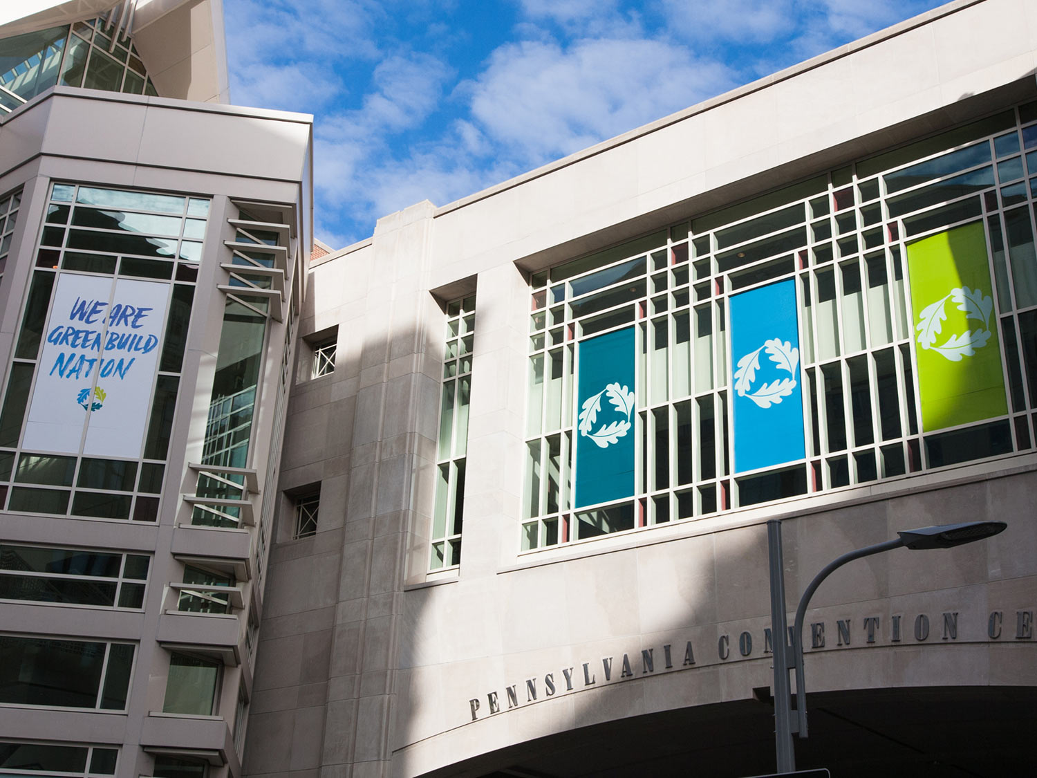
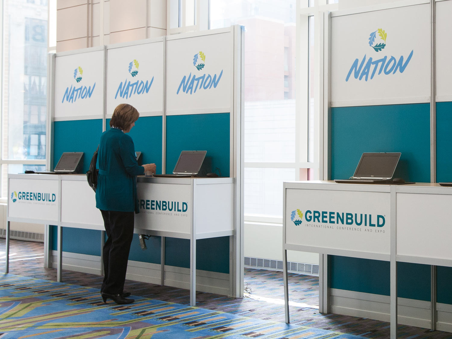
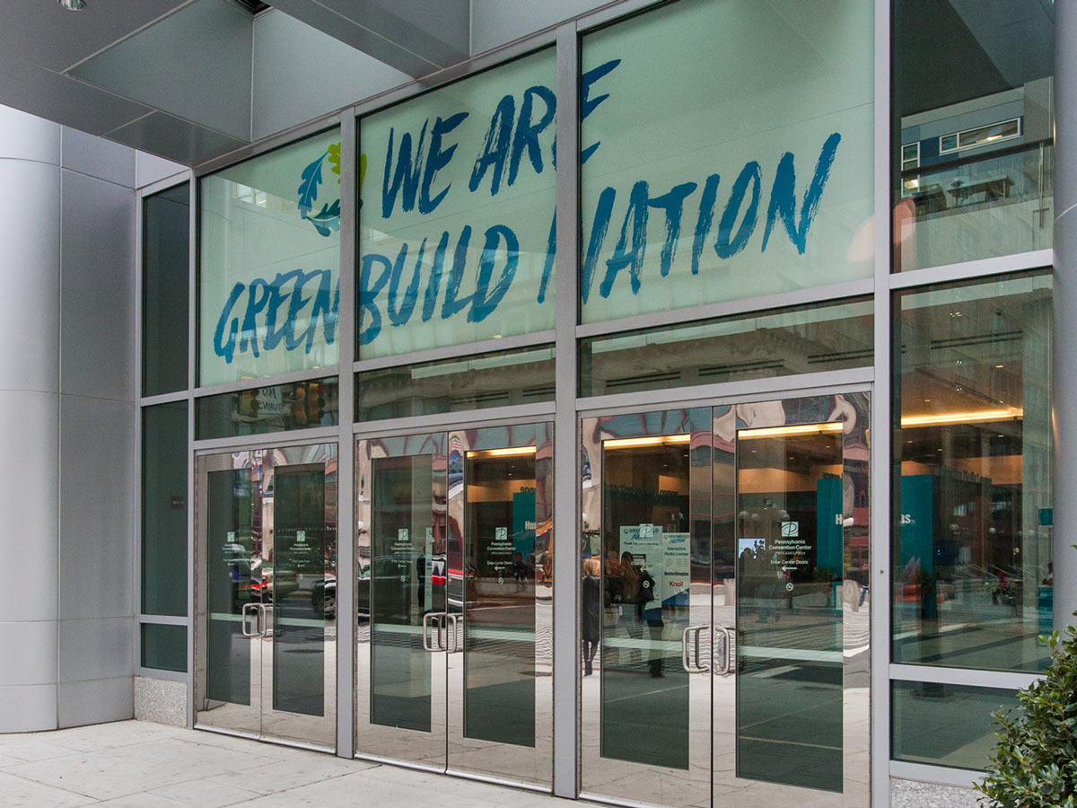
The 2013 conference theme of “Greenbuild Nation” was meant to unite a diverse range of sustainability stakeholders with a common purpose. Inspired by host city Philadelphia’s revolutionary history, we created a campaign based around bold, manifesto-like statements.
Our copywriting distilled the ideals of the green building community into a series of galvanizing proclamations.
Messaging that’s as strong as the visuals
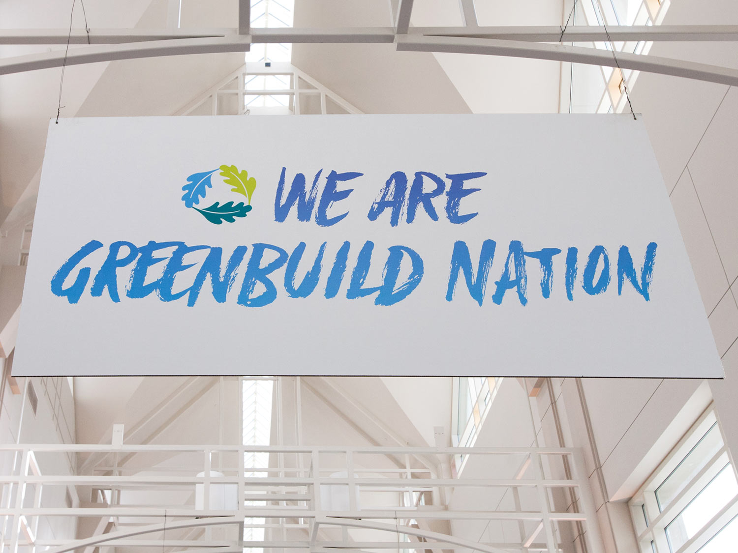
The manifesto-like text was embodied as vigorous brush lettering. These large emotional statements jumped off the pages of architectural and building publications.
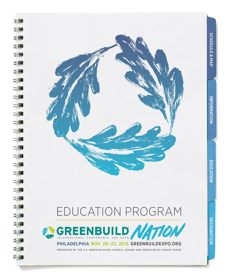
Color and design set the tone
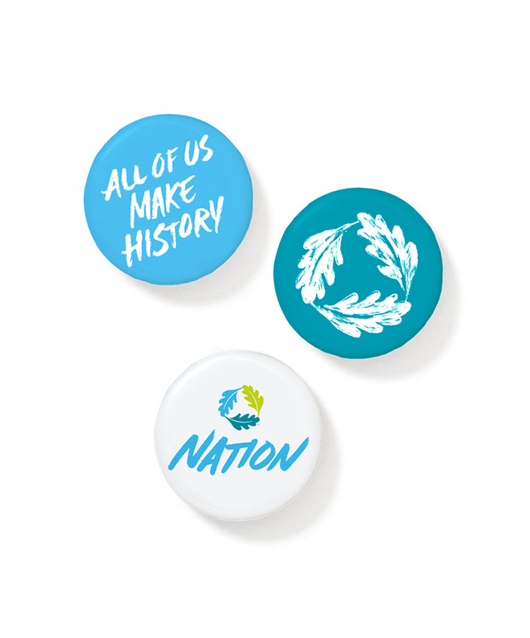
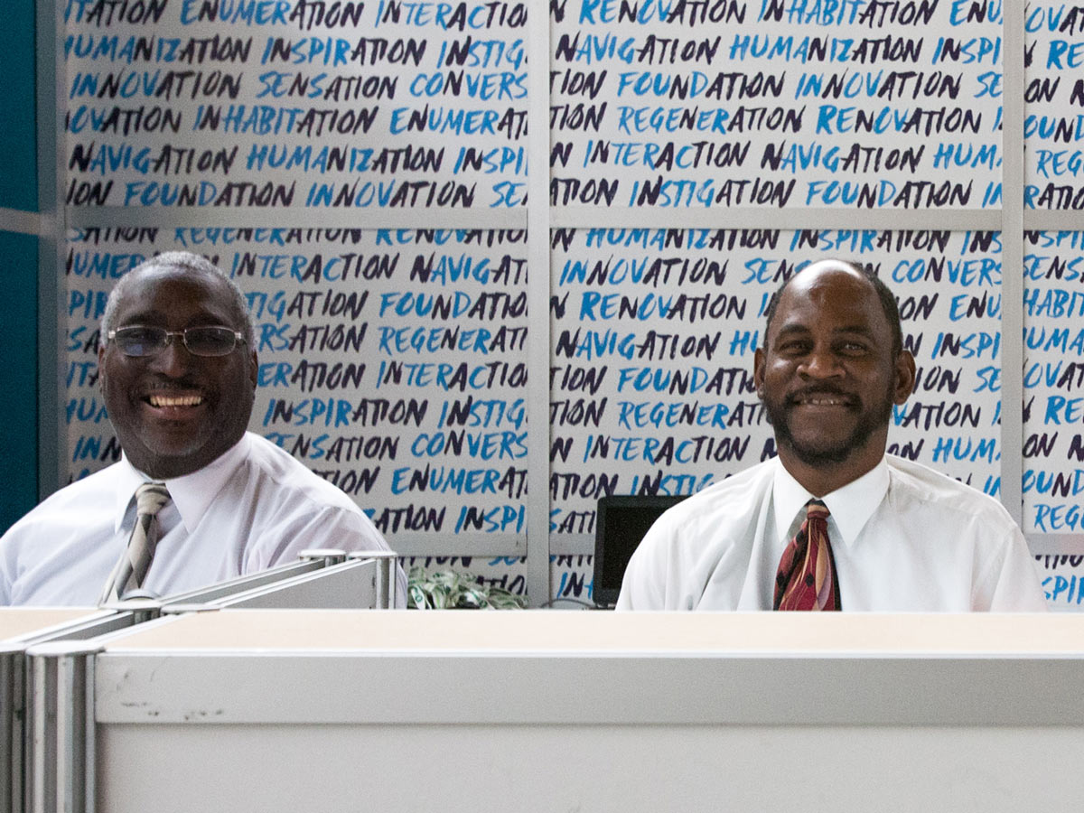
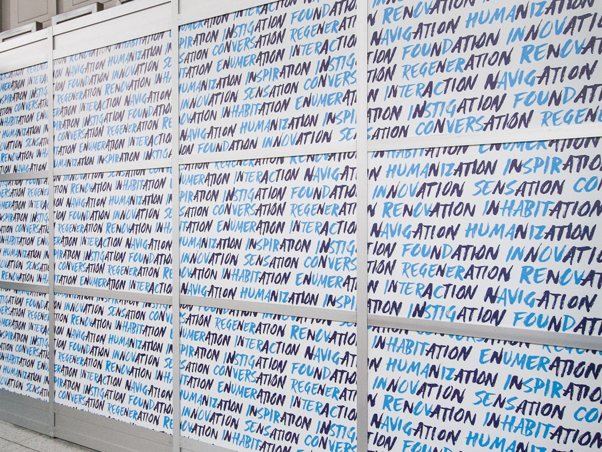
An optimistic color palette and a brush-drawn version of the Greenbuild logo, enhanced the energy of the conference. A pattern made from sustainability-related words containing “nation” added visual and emotional depth to the show design.

