“No dogs. No mountains. No revolutionaries. No farmers in overalls.”
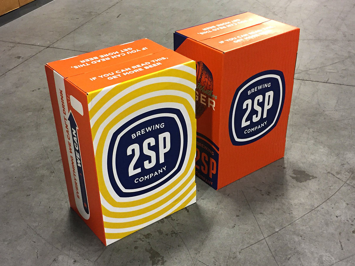
2SP is located in proudly blue-collar and un-hip Delaware County outside of Philadelphia. From the beginning, we agreed their brand should visually stand apart from the rest of the market and avoid craft beer clichés. We made this brewery look like nothing else on the shelves—an identity as distinct as its award-winning beers.
2SP makes world-class beer. Barrar’s 19 Great American Beer Festival and 10 World Beer Cup medals speak volumes.
Industrial Era Style
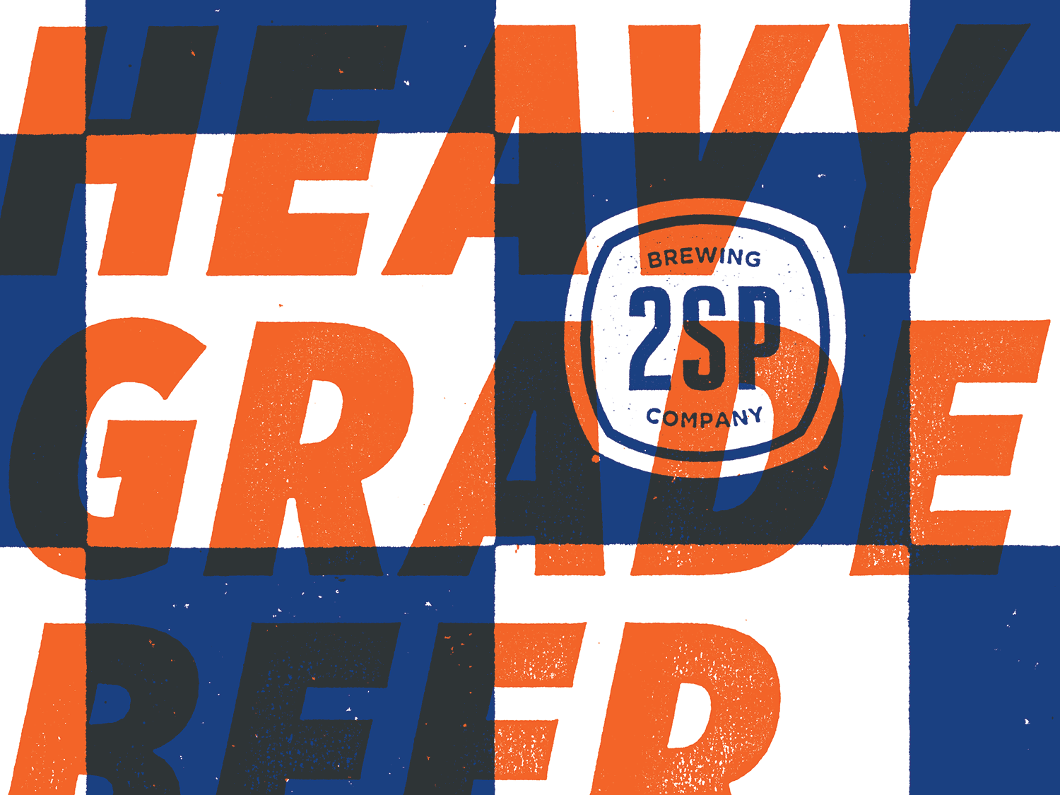
The name 2SP sounded less like a brewery and more like an auto parts manufacturer. Our branding for 2SP plays up this unexpected connection by evoking the bold, no-frills graphics of early 20th-century industrial design.
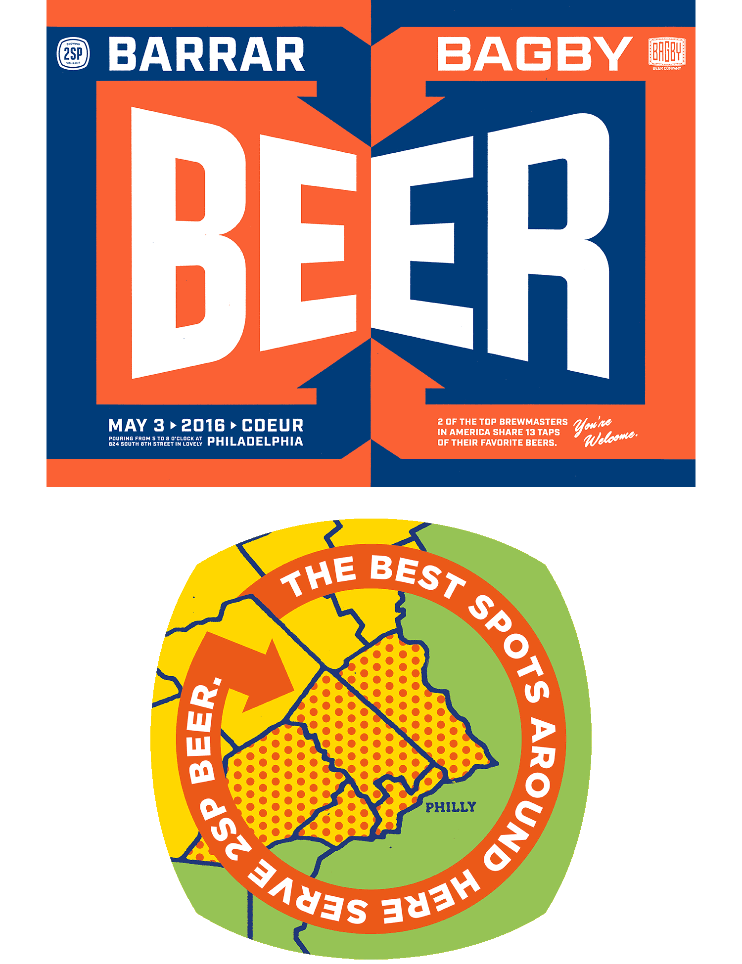
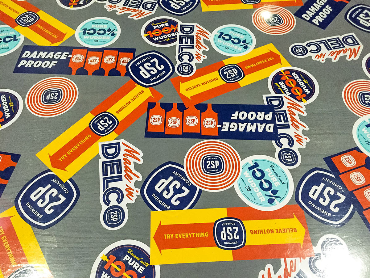
We mined local expressions and the language of classic advertising to create an instantly appealing voice for 2SP.
A Charismatic Personality
The 2SP team is smart, self-aware, and has a great sense of humor. Cheeky double entendres draw unexpected (and witty) analogies between beer and industrial products, reflecting the brewery’s brassy personality and Delaware Country origins.
Beer Cans That Stand Out
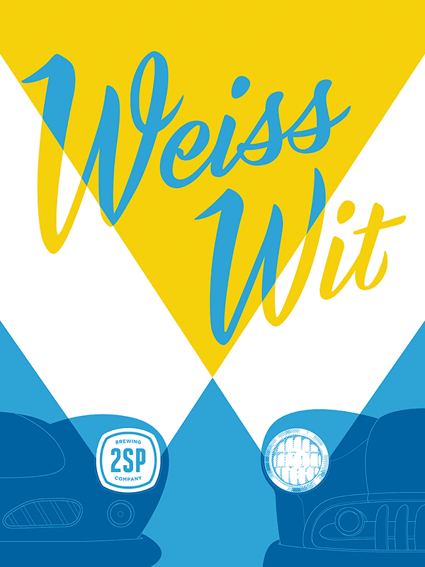
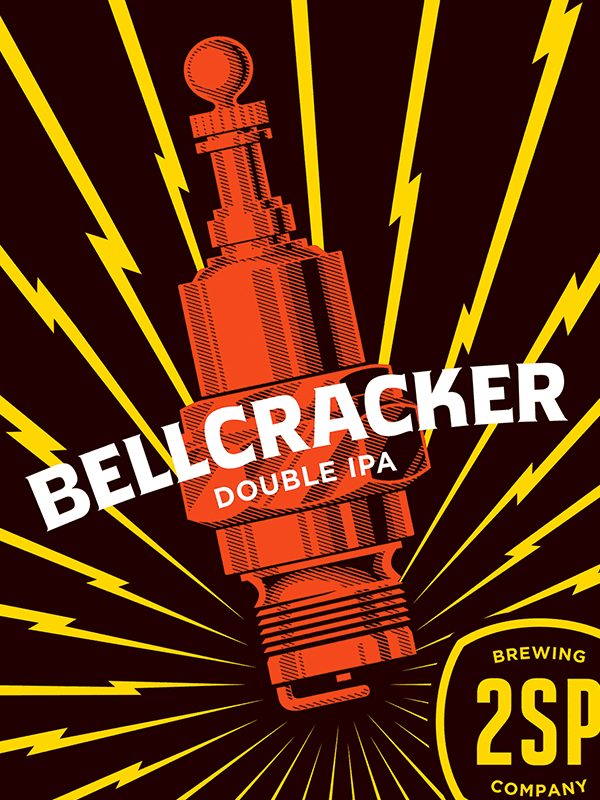
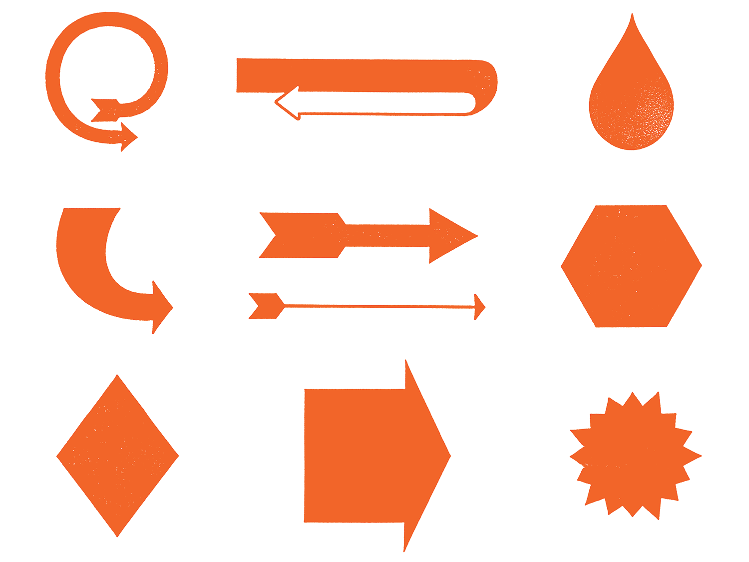
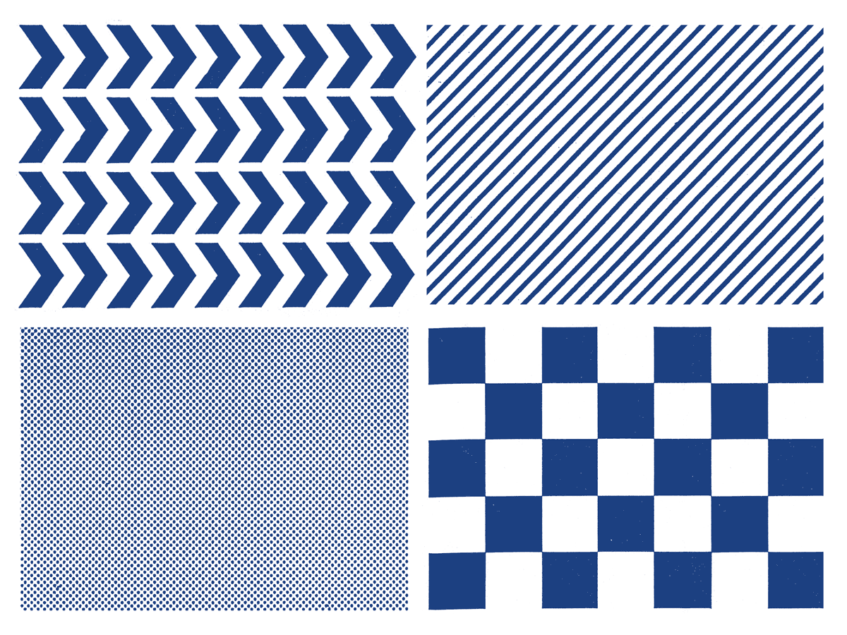
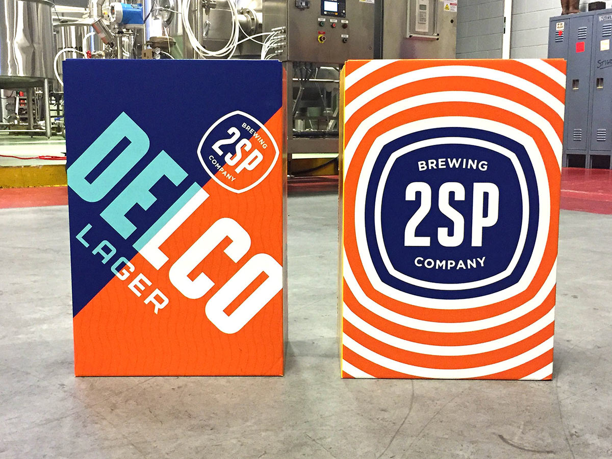
Continuing to play on the brewery’s industrial-sounding name, 2SP’s packaging recalls the bold look of classic oil cans. Distinctive color palettes along with custom lettering, illustration, and subtle patterning create unique looks for each beer. A cohesive stylistic approach makes 2SP cans a recognizable family.
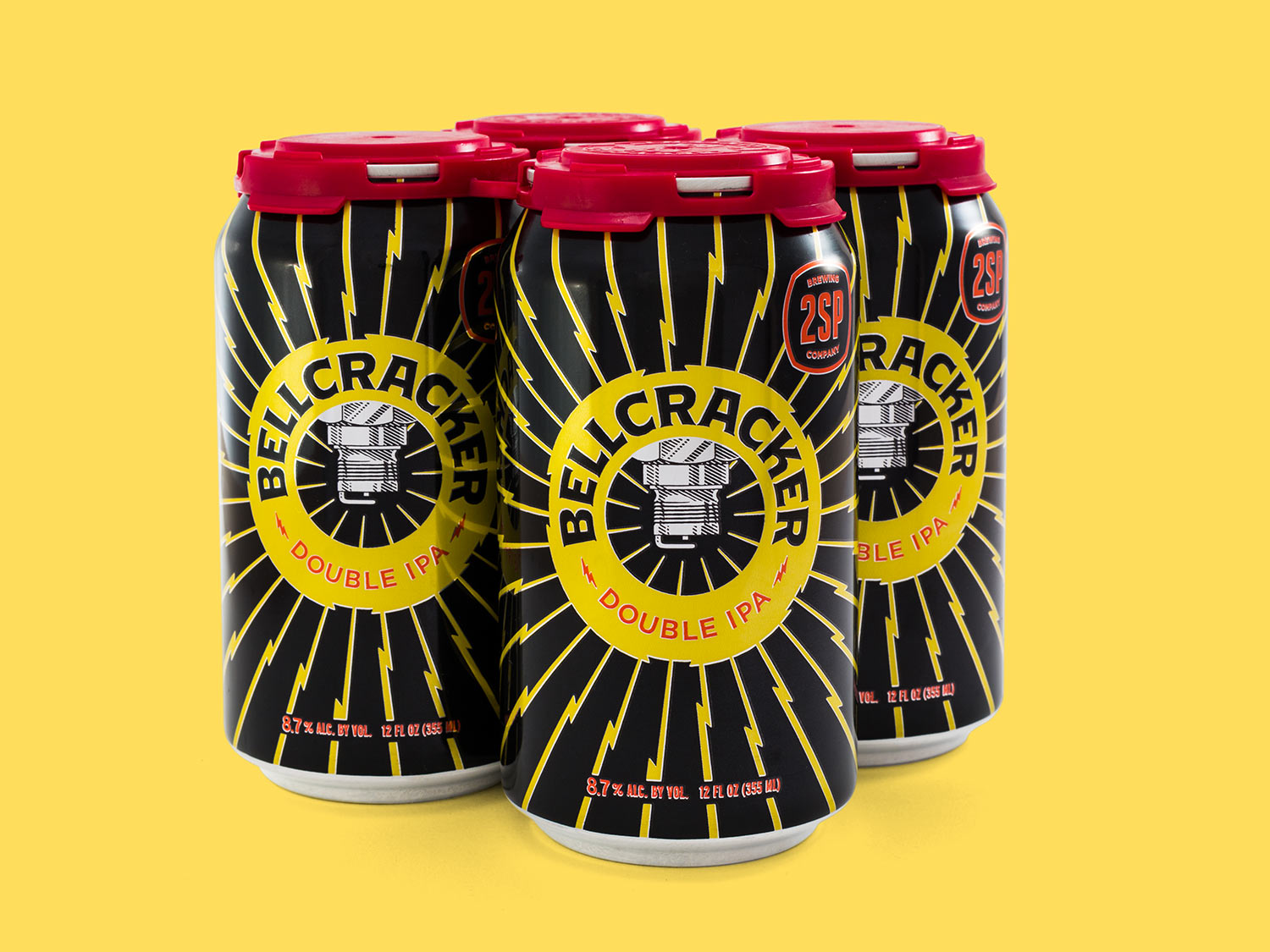
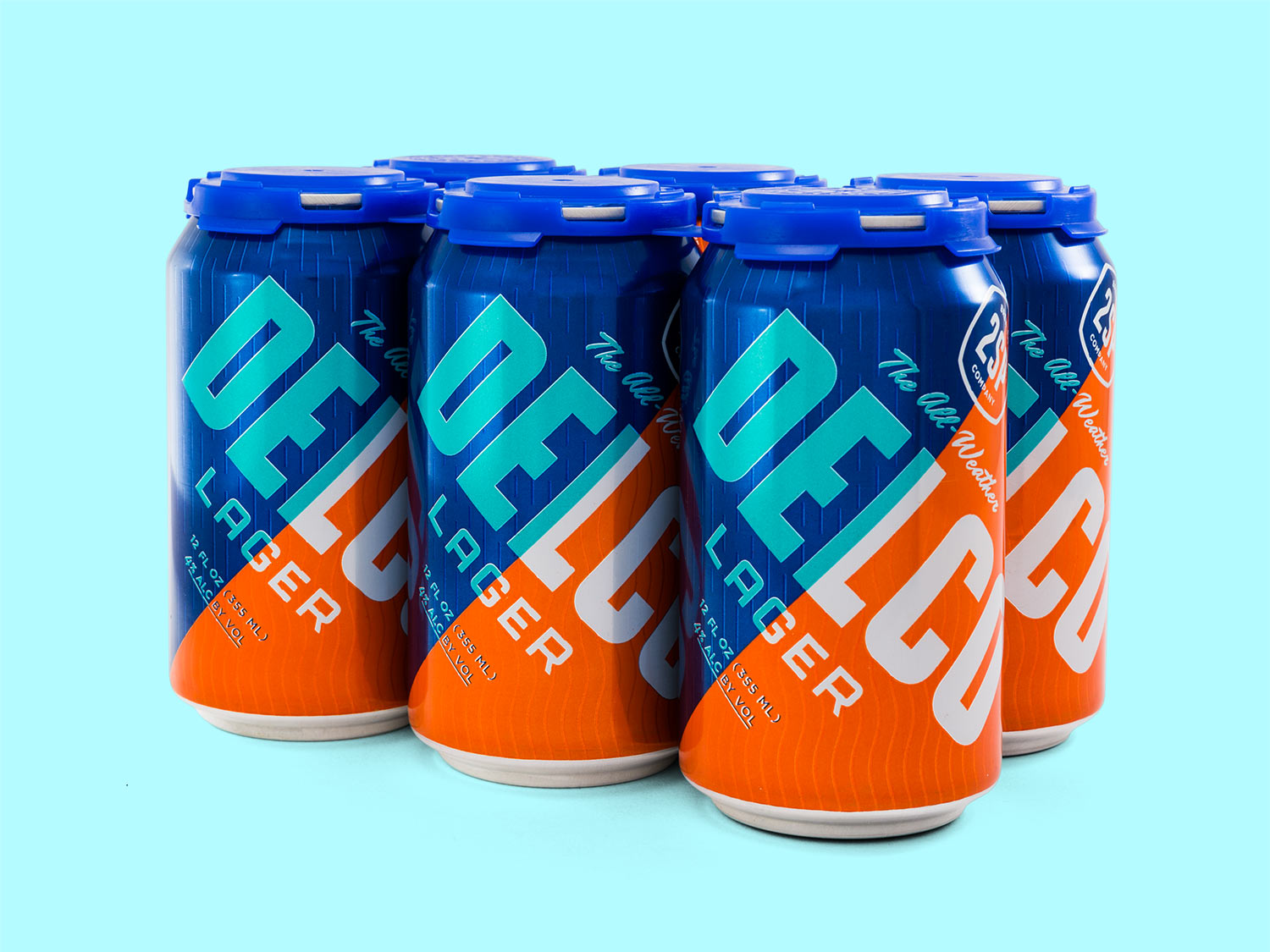
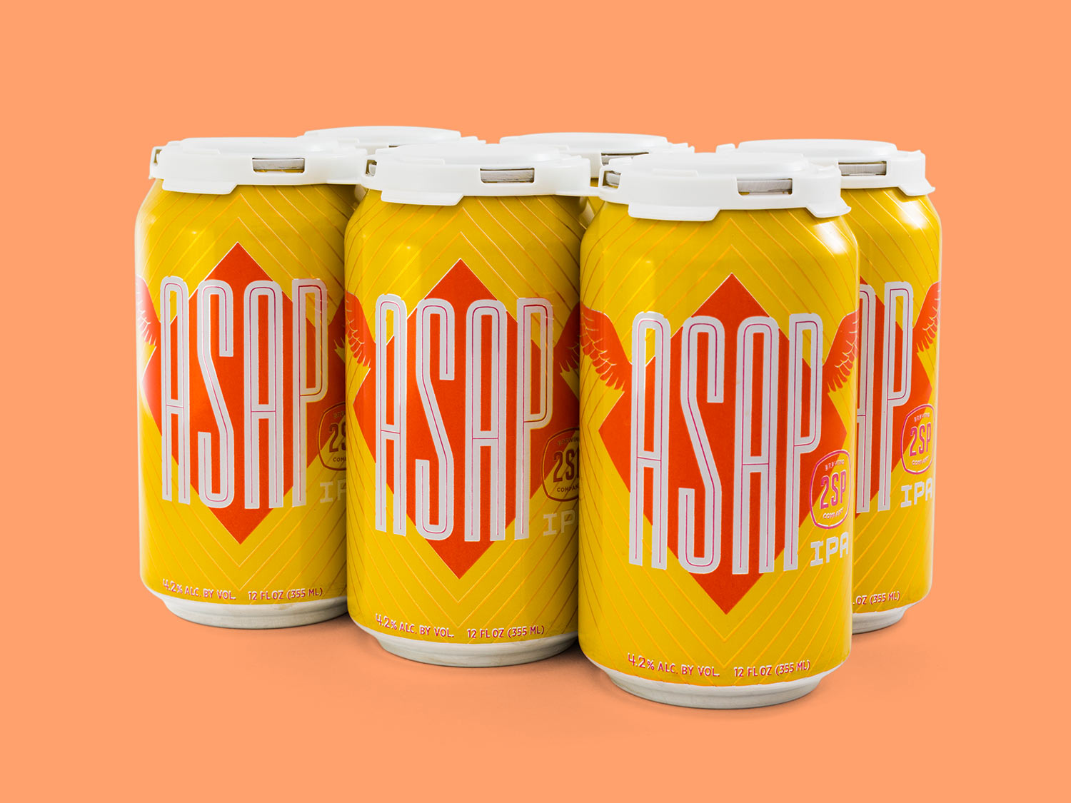
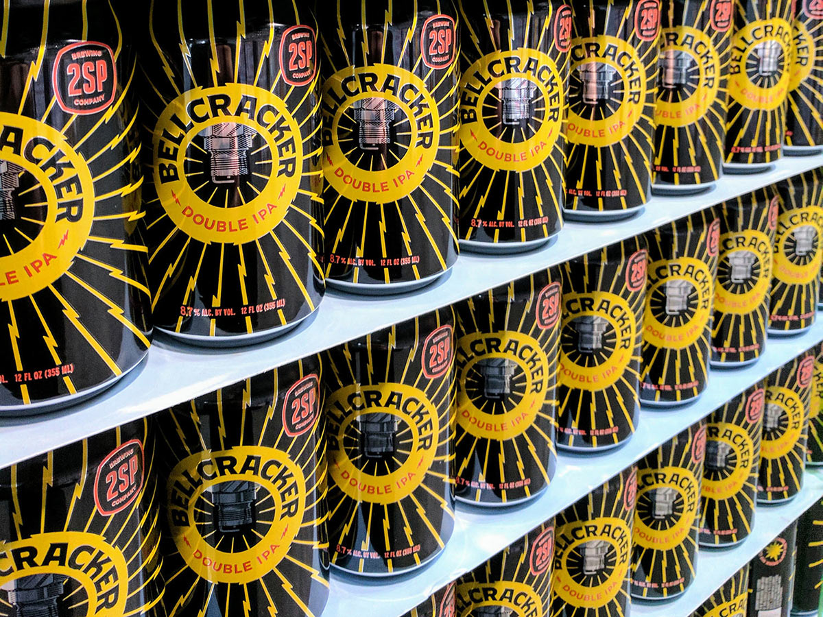
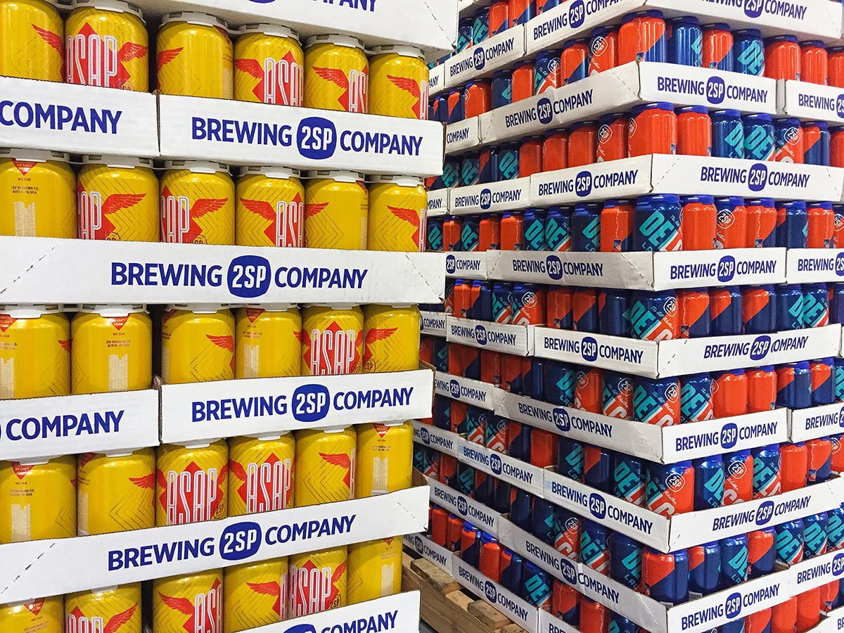
“Cans that Post Typography designed make up 30% of our business. This is significant because we currently have only canned 4 of our 50+ beers.”
— Mike Contreras, 2SP Director of Sales and Marketing
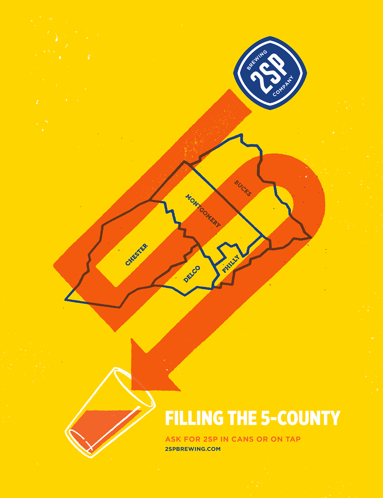
Expressive Posters
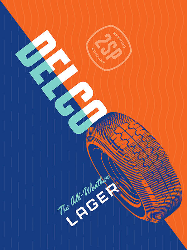
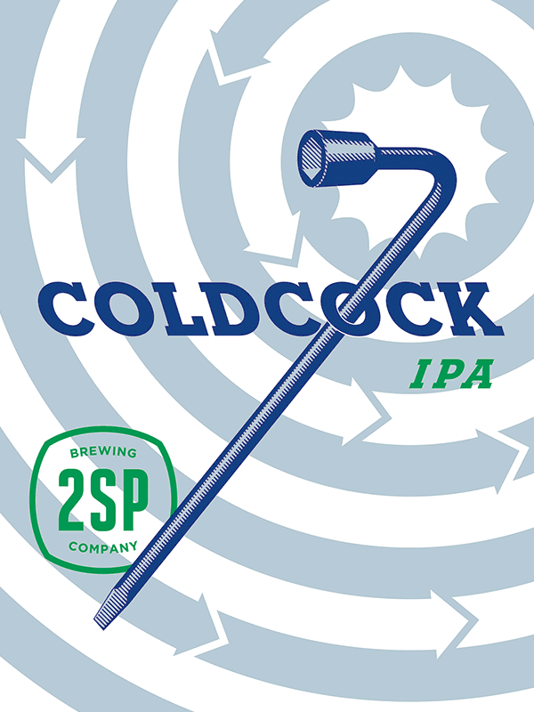
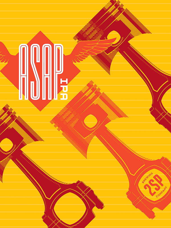
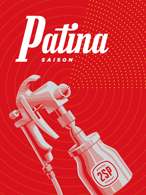
Each of 2SP’s signature beers gets a memorable, collectable poster. Witty pairings with auto parts or tools drive each design — a tire for the “All-Weather” Delco Lager, pummeling pistons for ASAP, and a spray gun for Patina.


