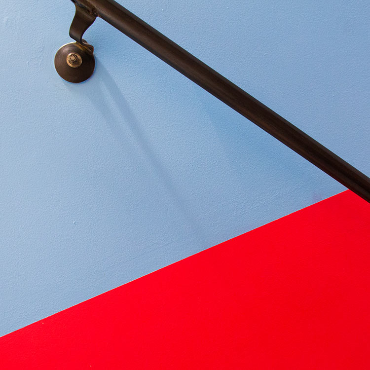
Energizing a daring new cultural space and rebranding a growing film organization.
Since its inception in 1999, the Maryland Film Festival has grown into one of the nation’s premier small film fests. Following an $18 million fundraising campaign, the Festival was expanding to operate year-round in a beautiful new three-screen movie theater. We completed an extensive rebrand of the organization, including the design of environmental graphics and signage throughout the Festival’s award-winning SNF Parkway Theatre.
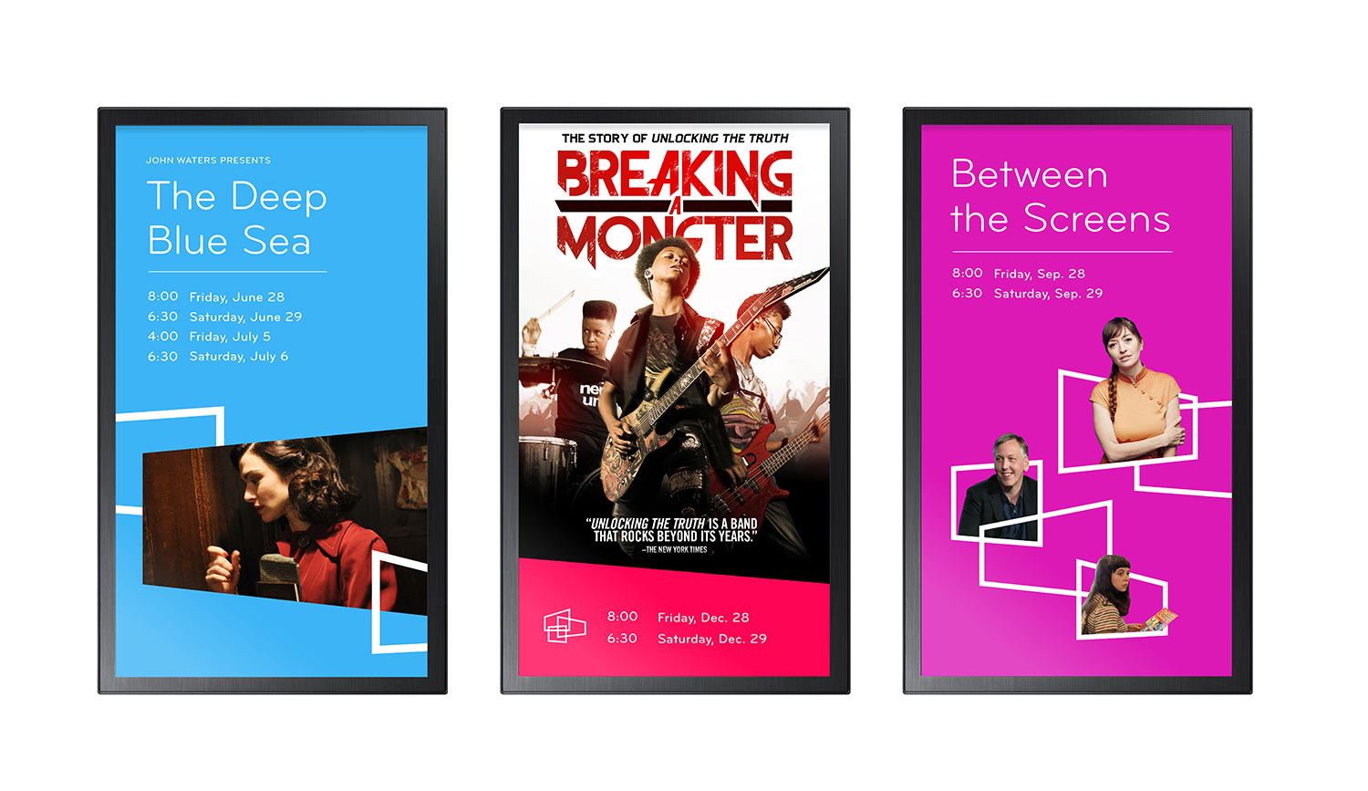
Three distinct screen-like shapes represent the Parkway’s three theaters, MdFF’s three main arms, and the diverse perspectives of filmmakers and audiences.
A flexible family of logos
We renamed the parent organization MdFF to distinguish it from the annual festival. To make the acronym more unique, we represented “Maryland” with a lowercase “d.” A family of unique marks differentiates each arm of the organization. This flexible system is designed to accommodate future MdFF-branded projects.
A bright, energetic visual voice
MdFF wanted their brand to reflect the Festival’s programming: sophisticated, warm, and inclusive. We developed a pop color palette and paired a friendly-yet-refined typeface with three custom-lettered logos. The identity’s flexible design elements suggest cinematic devices such as framing, motion, and perspective.
This contemporary design approach has helped MdFF to stand out among Maryland and Washington, DC cultural institutions.
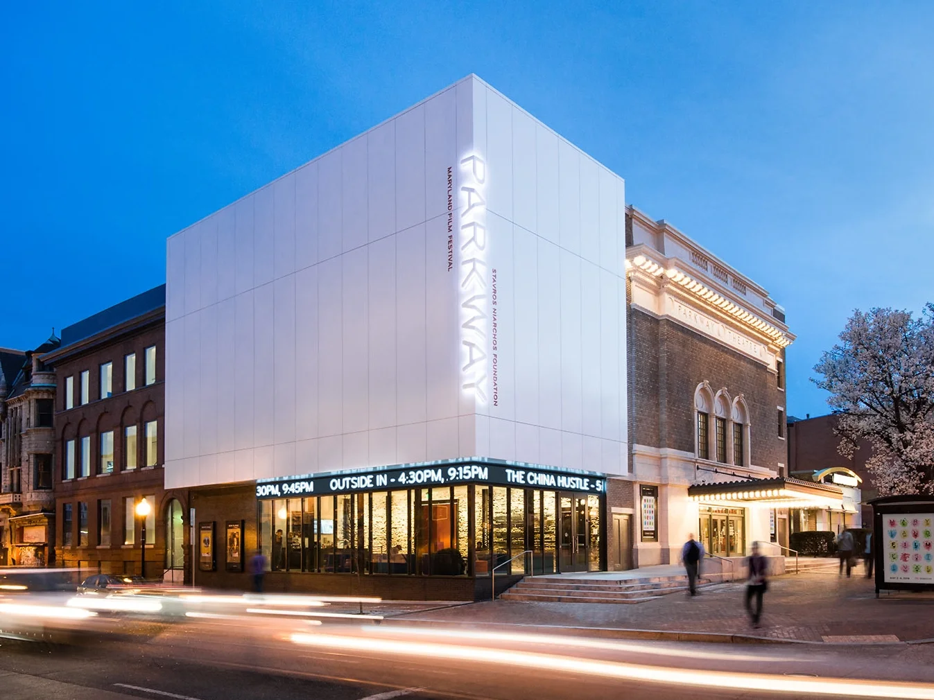
Our environmental design for MdFF’s SNF Parkway accents the theater’s stunning architecture and showcases the graphic identity’s flexibility.
A provocative architectural design
Ziger/Snead Architects’ unique approach to Parkway celebrates the building’s 100 years of opulence, decay, and reinvention. Assertively modern interventions mix with a century of history, resulting in a “rescued ruin” where layers of the past coexist with the future.
Attention-grabbing signage
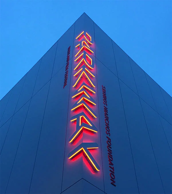
We emphasized the intentionality of the building’s bold architecture with an equally unconventional white-on-white sign that wraps around the corner of the new building. This sign has already become a recognizable landmark on one of Baltimore’s most prominent corners. At night, the white-on-white signage glows with subtly shifting colors.
The Parkway has received multiple honors that include AIA Baltimore’s 2017 Grand Design Award and AIA Maryland’s 2017 Citation Award among others.
An enchanting interior
We created a visual focal point in the main lobby with six-foot-tall illuminated steel letters against a long wall of MdFF’s signature fuchsia. This monumental sign draws visitors into the space, making moviegoers feel like they’ve arrived someplace truly special.
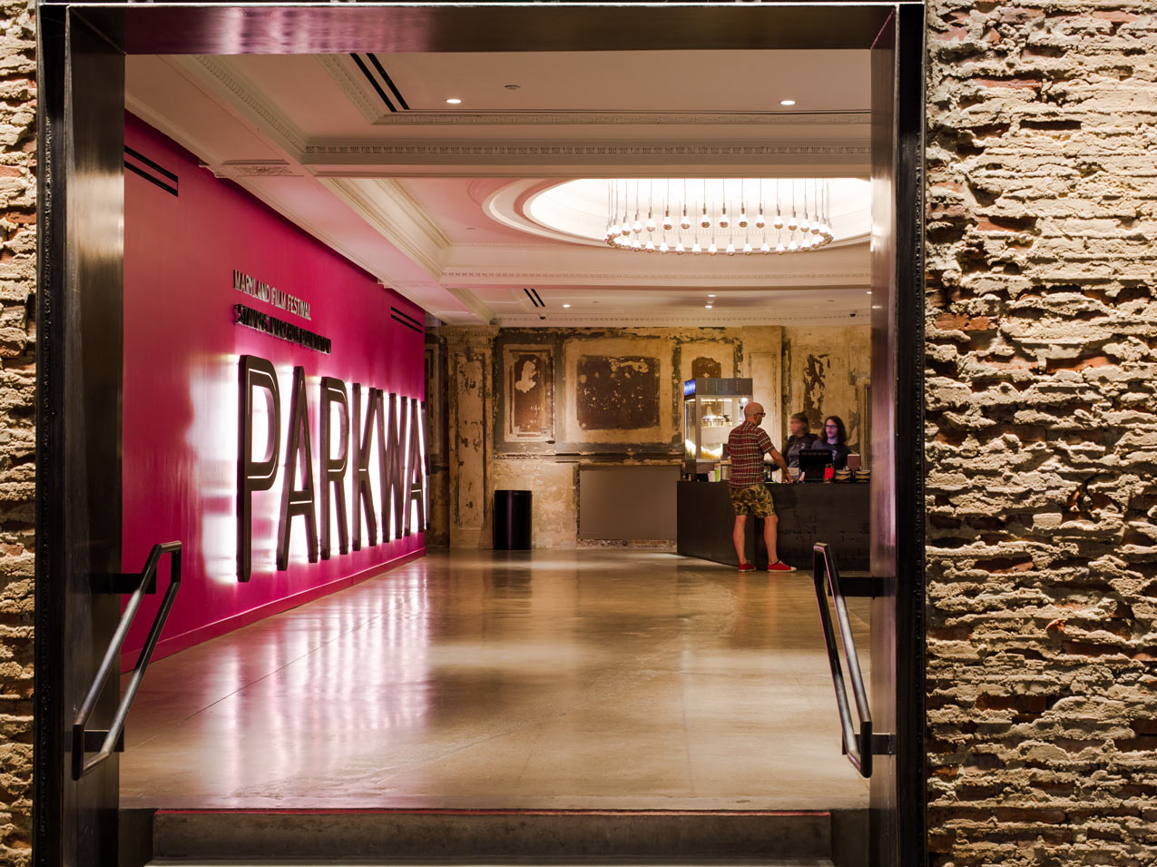
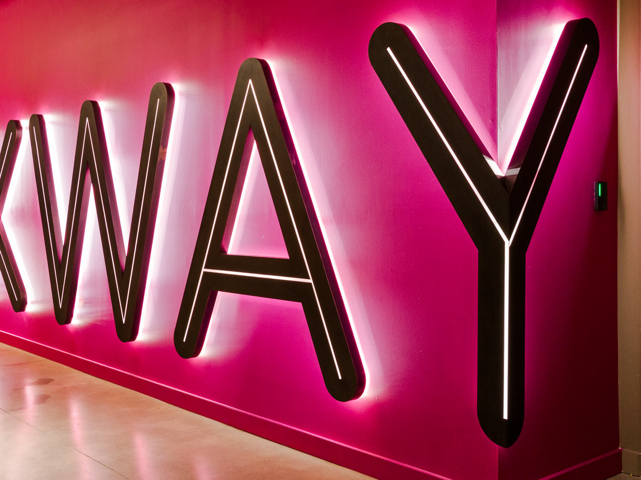
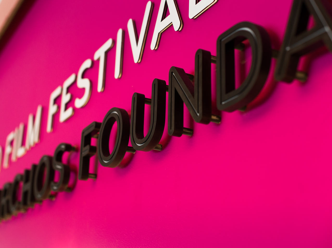
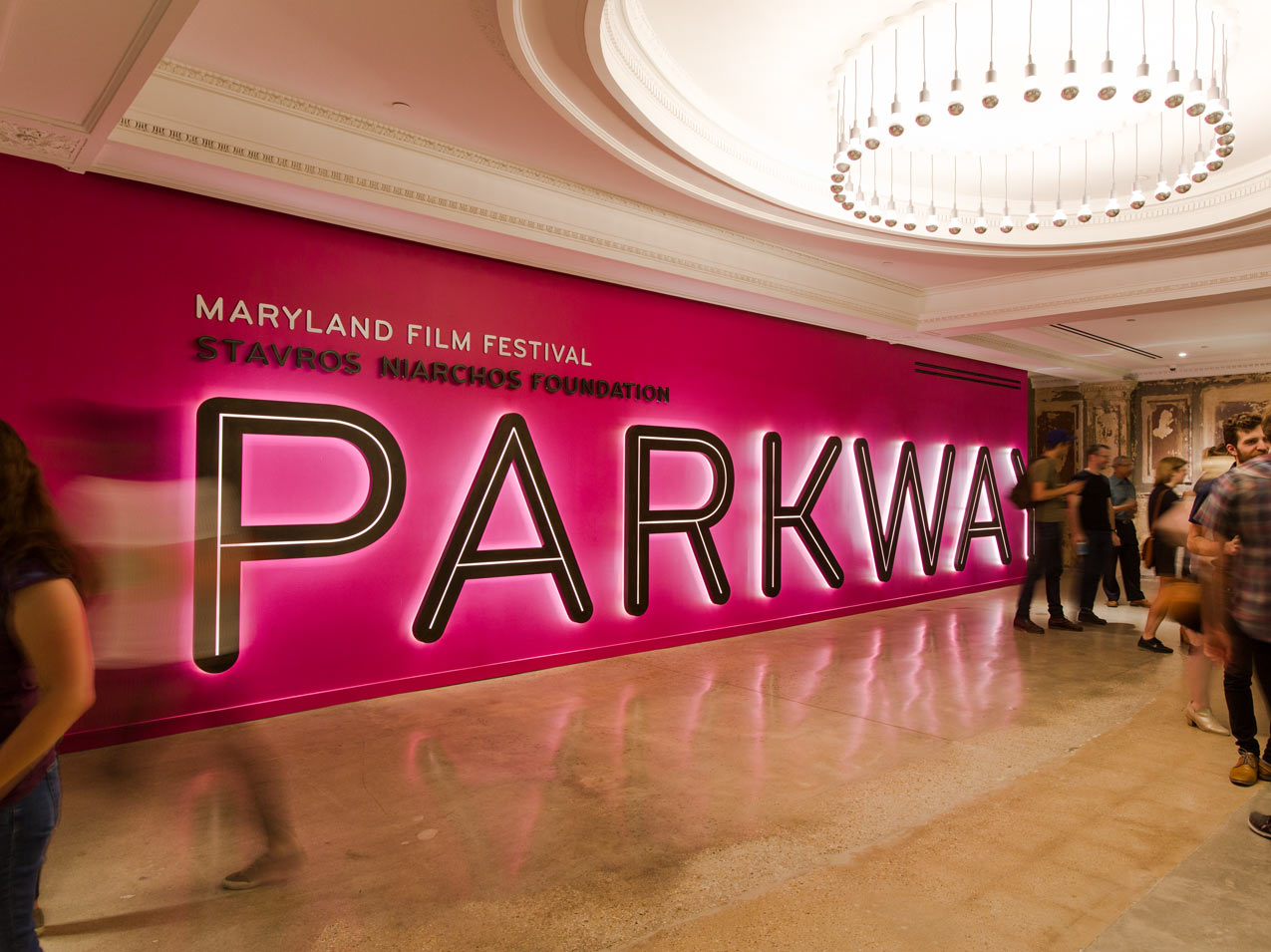
We introduced hits of vibrant color to contrast with the muted shades that predominate in the historic building. These bright colors energize the space and delineate between new and preserved surfaces.
Dynamic Wayfinding
Wayfinding graphics play a leading role in the experience of visiting the Parkway. Prominent directional signage guides visitors through the 100-year-old building’s complex floorplan. Cinematic frames project across wall planes and textured surfaces and highlight architectural details. We painted these wayfinding graphics directly onto the walls, adding a new layer to the palimpsest of history in the historic building.
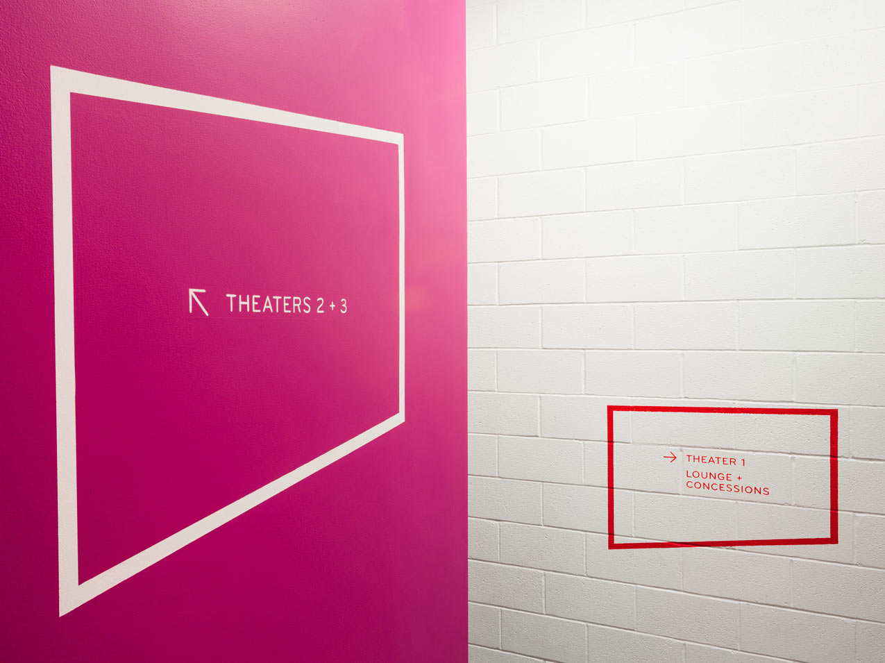
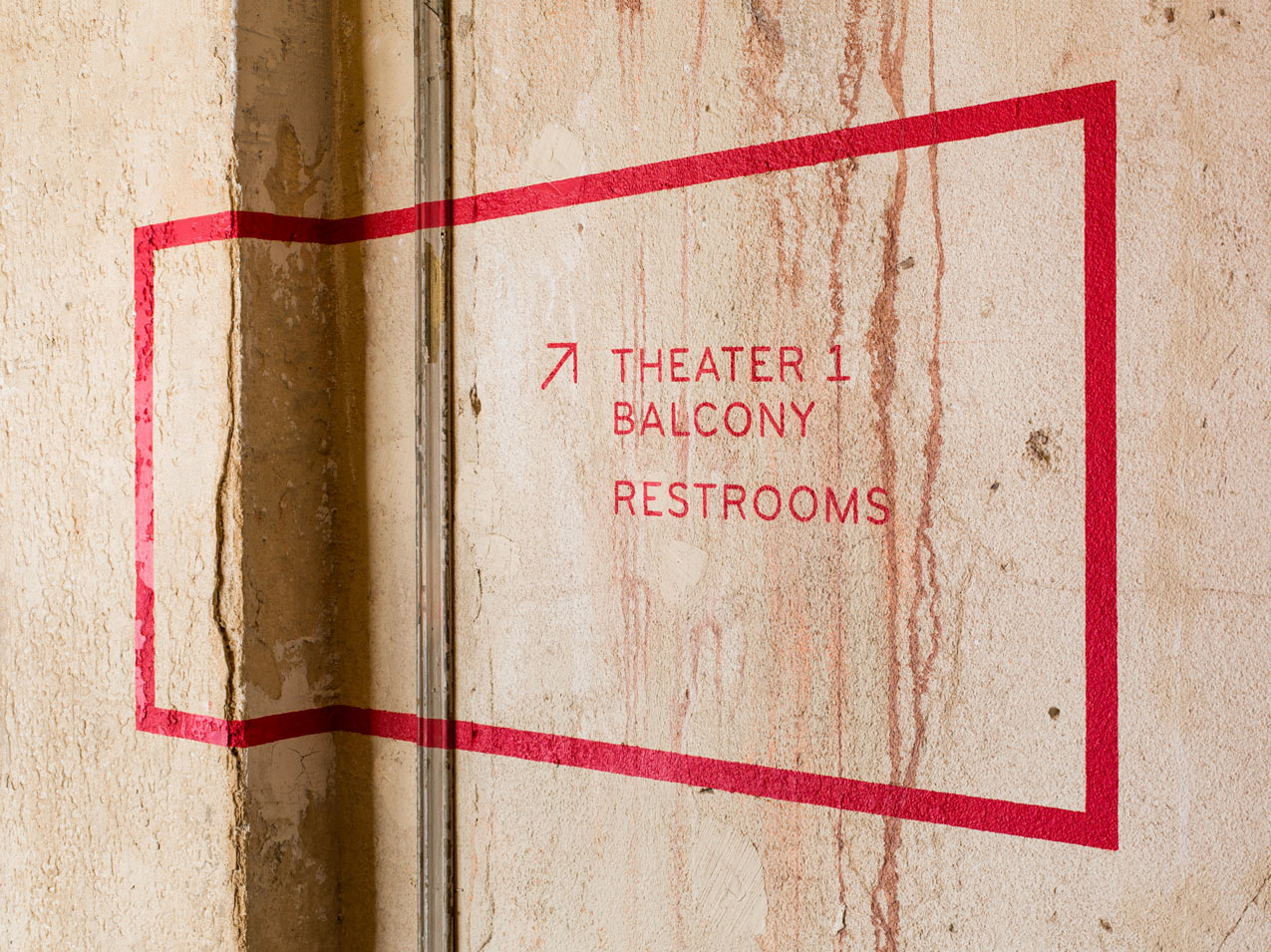
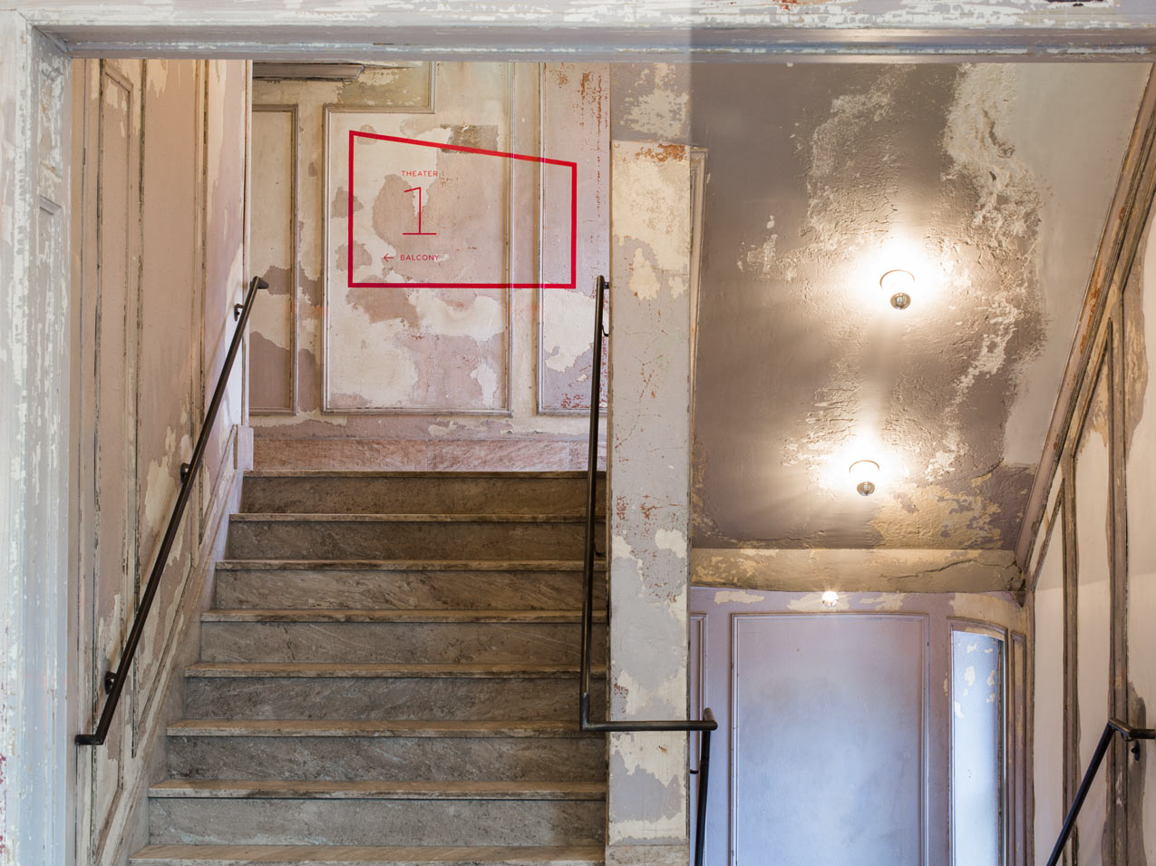
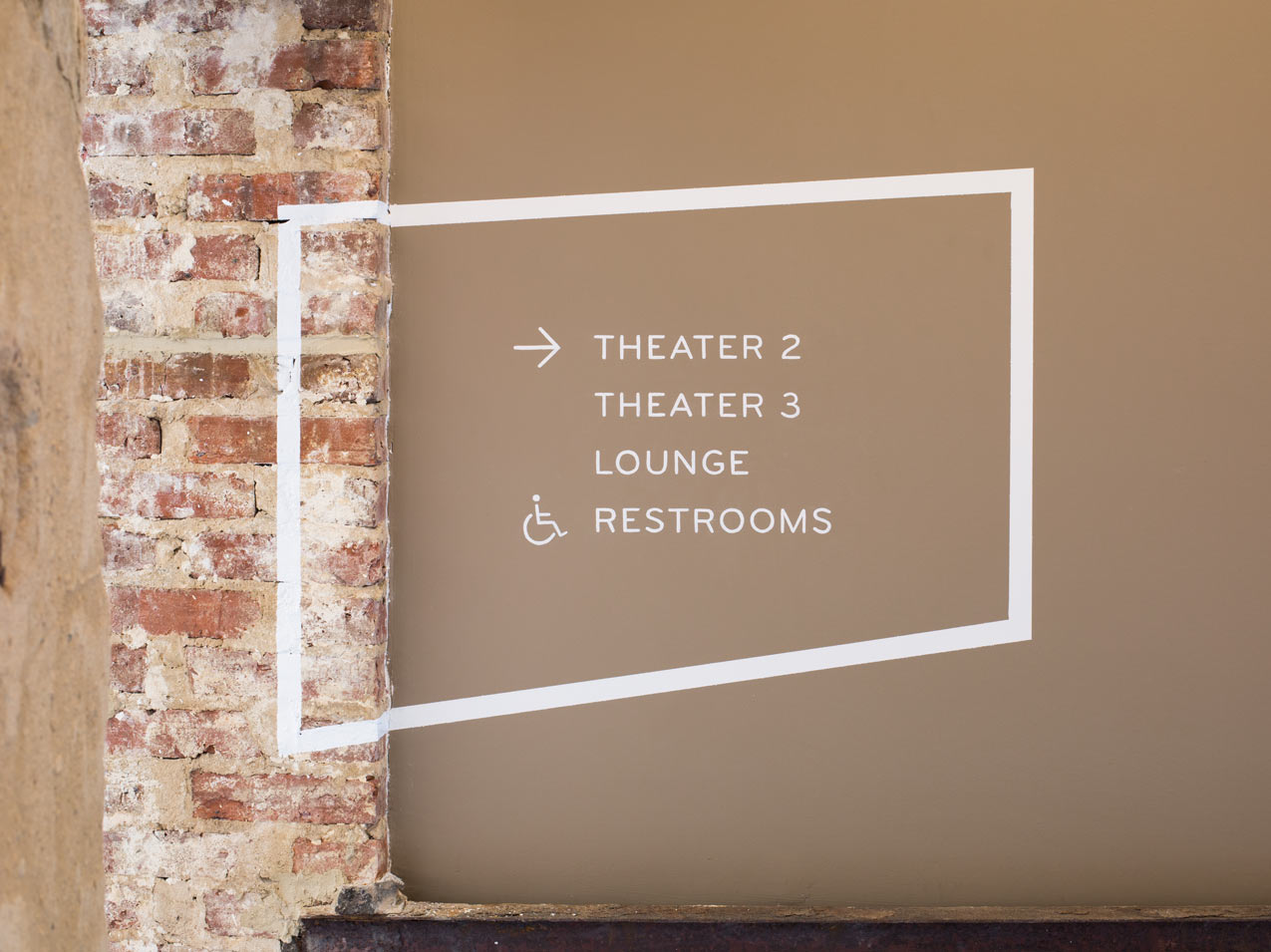
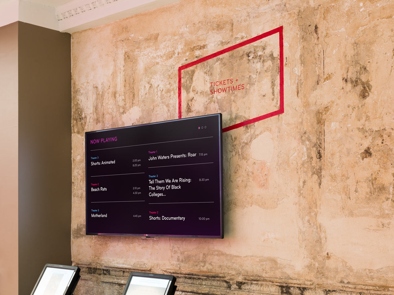
We used striking environmental graphics to create moments of discovery throughout the building.
Going up… surprise!
Theaters 2 and 3 are reached by either stairs or elevator. A giant Parkway logo spans the full three floors of the building, with the elevator doors creating cinematic crops or “edits.” Bold accent colors coordinate with theater upholstery and act as a secondary wayfinding element.
A distinguished donor wall
We acknowledged Parkway donors with a dynamic composition or raw steel planks that stand out from a wall of exposed brick in the Parkway’s lounge. Varied depths and sizes differentiate among the six tiers of gifts. A painted Parkway logo wraps the neighboring steel column, echoing the theater’s outside corner signage — both interior and exterior signs are visible from the street.
A sculptural approach to the donor wall harmonizes with the building’s exposed structural steel.
Inventive informational graphics
We seamlessly integrated expository signage into the building’s architectural features. Large-scale graphics that incorporate archival photography tell of the history and rebirth of the Parkway.
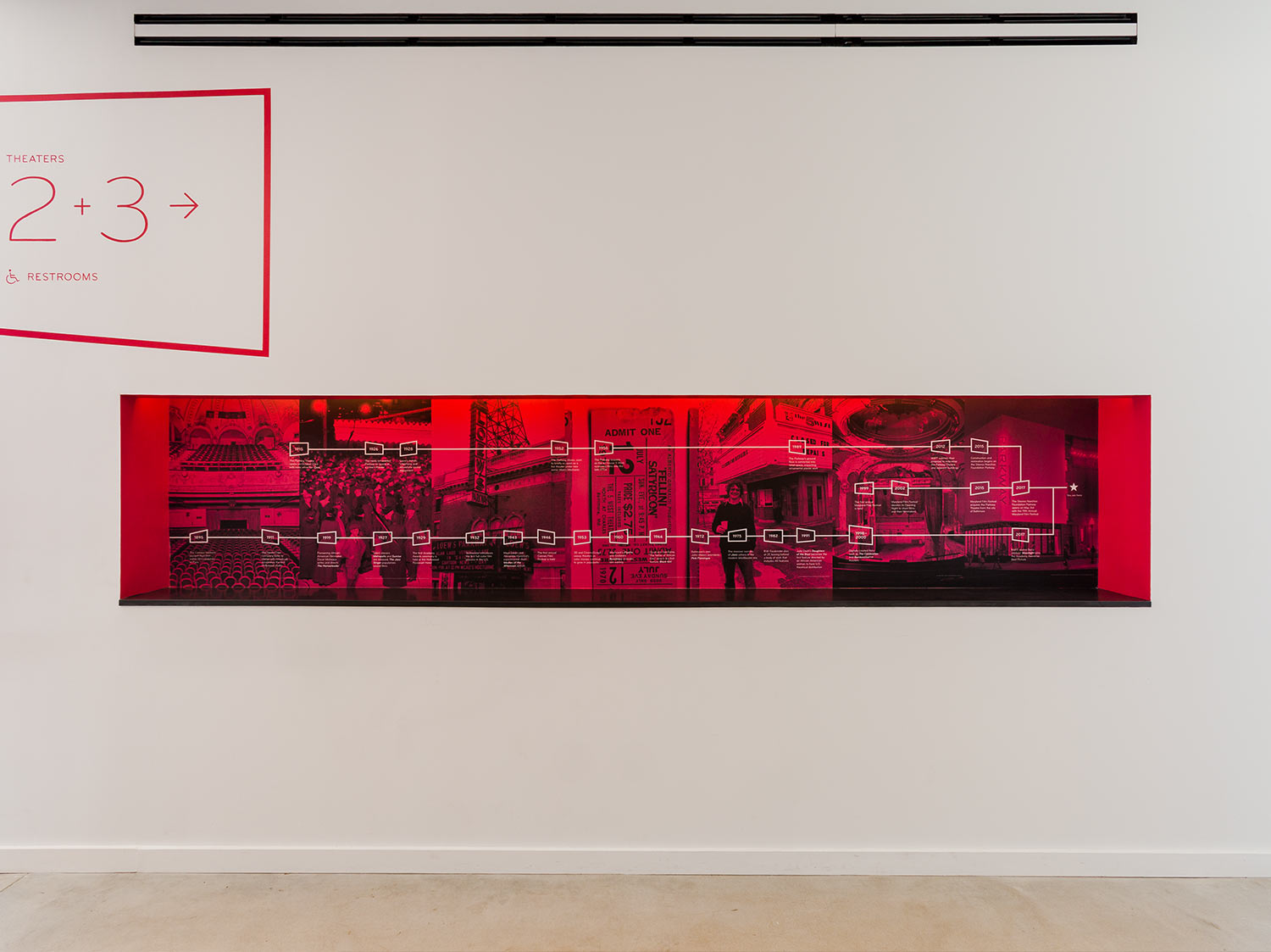
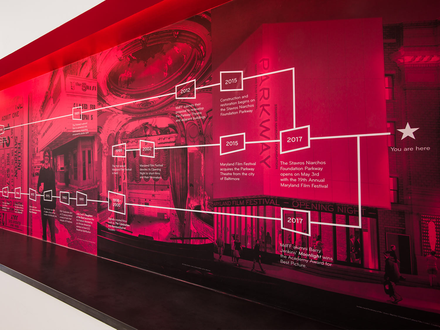
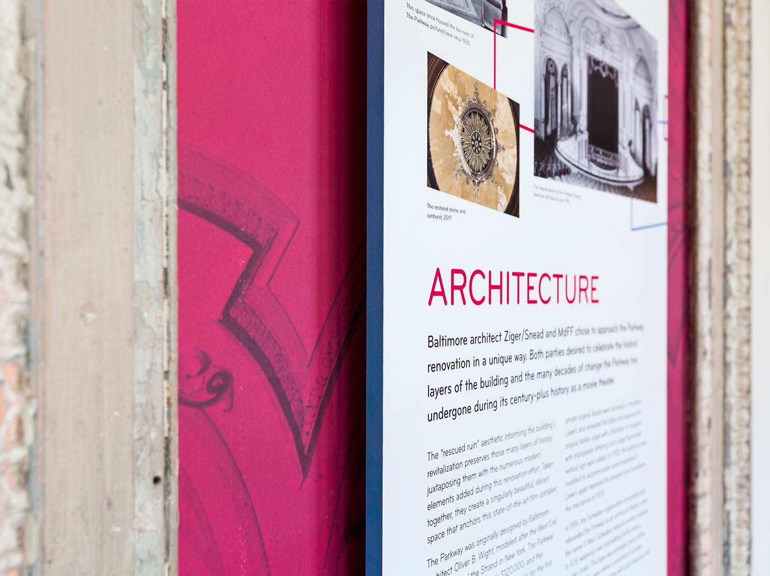
Scattered throughout the building, these colorful niches add to the Parkway experience and provide fun moments of discovery.
Designing a memorable experience
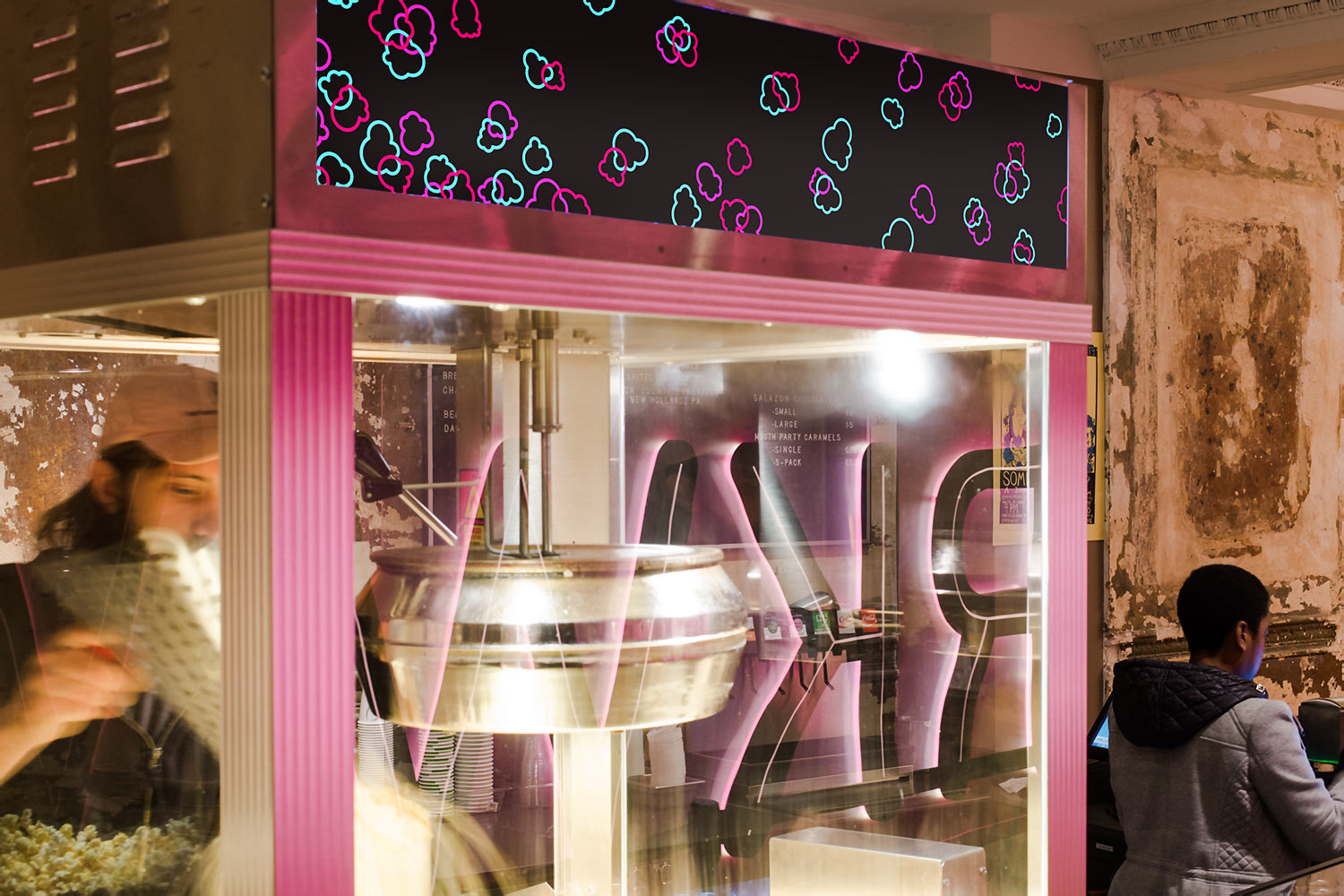
Every detail counts. We designed everything from a custom bathroom wallpaper to an MdFF-branded popcorn machine to enhance the Parkway experience.


